The Art of Outdoor Eats
By Chef Corso
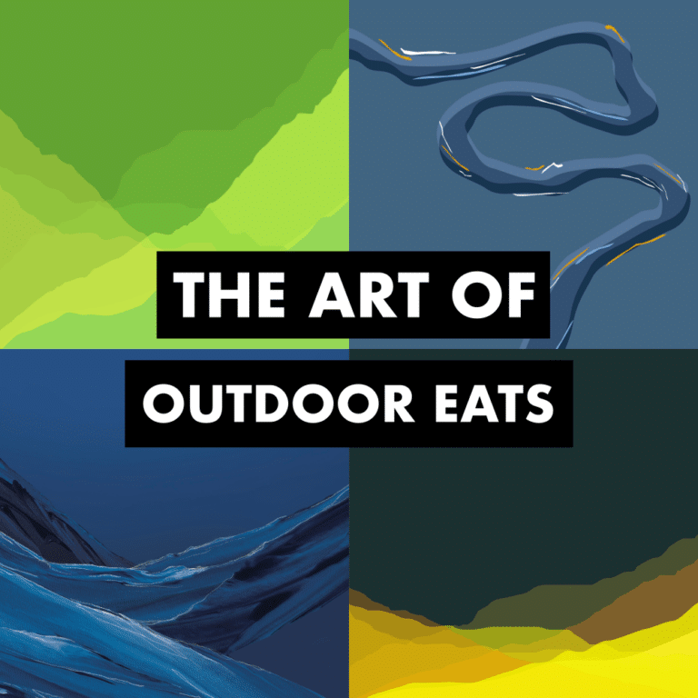
I share a lot of recipes and tips for cooking outdoors here on the website but I wanted to share a little bit about another important part of the business of Outdoor Eats. Art, photography and design.
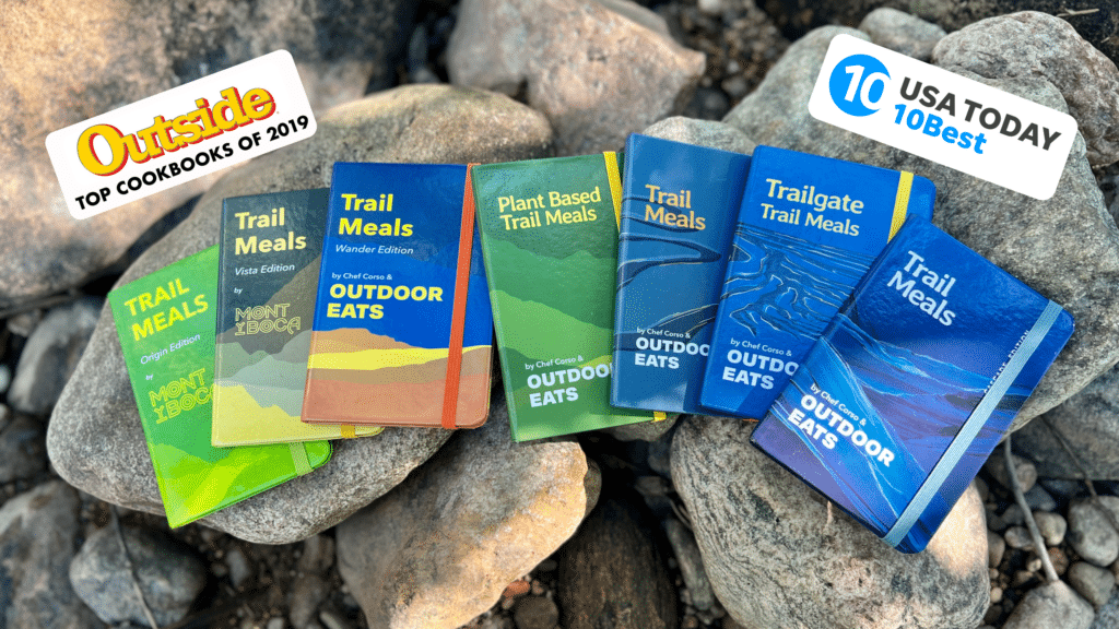
As Outdoor Eats hits it’s 5th birthday this year, I wanted to pull the curtain back on the design of our logos, our Trail Meals cookbook series and most importantly, the fantastic artists, designers, photographers and creators that have helped bring my vision to life. As you will read, it’s very much a collaboration with a lot of very creative people contributing along the way.
I’ve always been really interested in art in different mediums. Whether that’s pencil line drawings, stained glass, fonts, architecture, sports logos, posters for concerts, good editing of a film or classics like Picasso or Monet. There’s artistic elements in each of these styles that I appreciate and it’s always fun compare and contrast. Color has also always caught my eye in different ways as well. The difference between baby blue, Carolina blue, teal, aquamarine, sea foam and other light blues on the spectrum is fascinating to me. This is also assuming that you can see color. Also fascinating! That all color is just in our eyes and our head and it’s very open to interpretation.
The Beginning – 2019
Sattva Photography / Alex Bodi Hallett – photography, videography
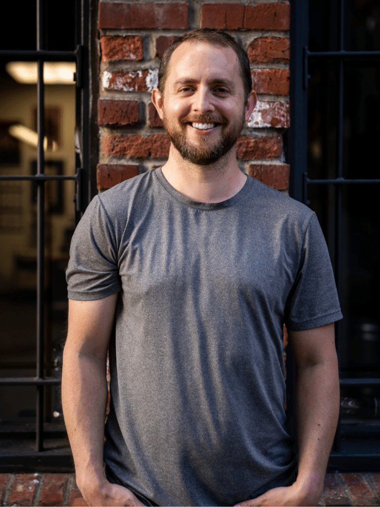
When I first had the idea for Outdoor Eats and put energy into building a website I knew I needed some help. I’m a solid photographer and our smart phones in our pockets keep getting better and better but for a nice polished looking website I needed help. I had a family friend from my hometown of Port Angeles, WA named Alex Bodi Hallett that I knew was a photographer. I was following him on Instagram and Facebook and I loved some of this work. www.sattvaphoto.com
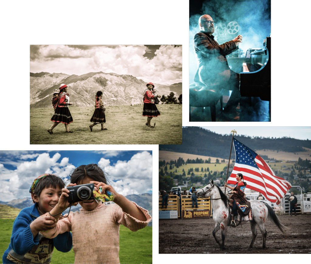
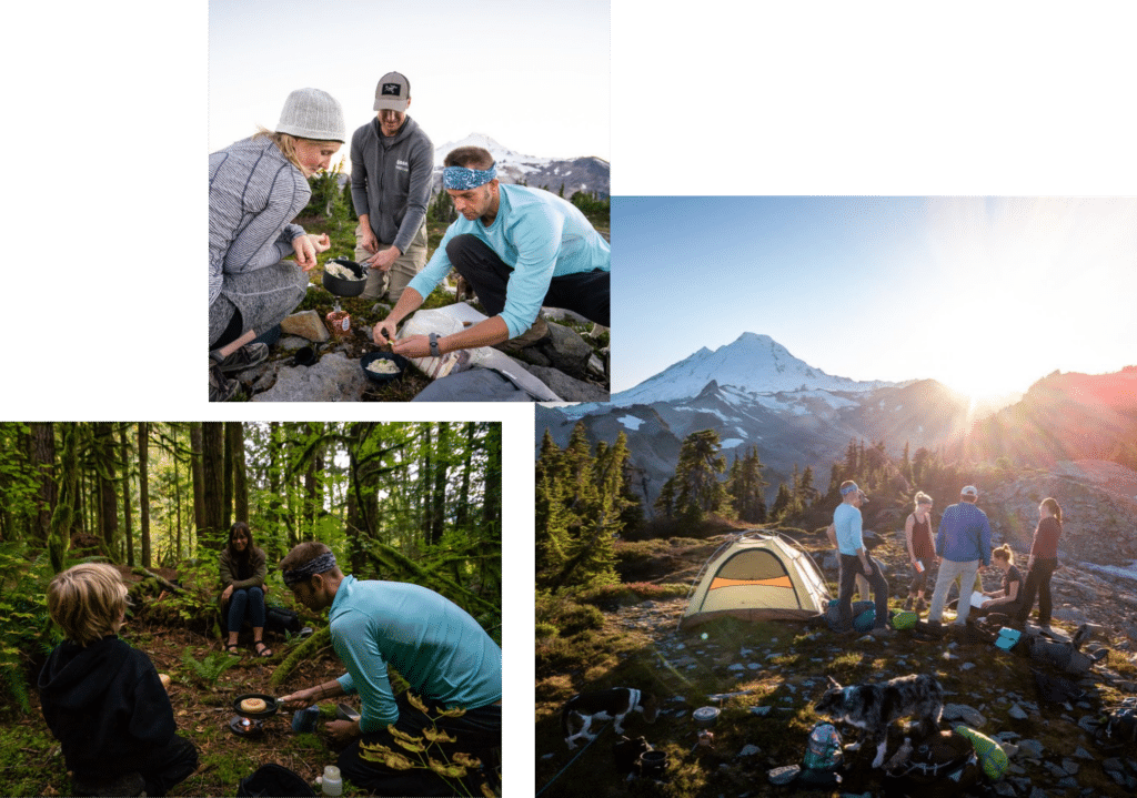
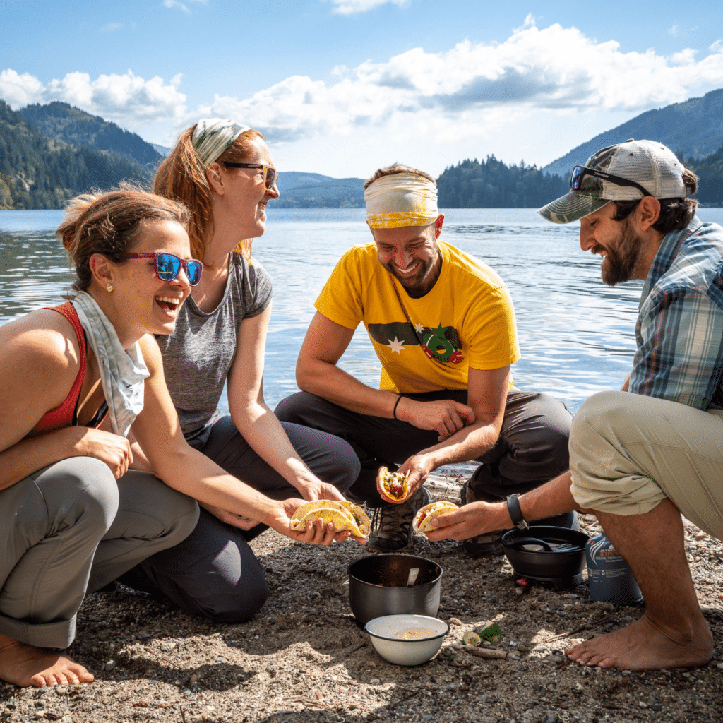
What I loved about Alex’s work, is that it really captures some human experiences while being very mindful of color and spacing. I connected with him over email and asked if we was up for a side project. As luck would have it, he was keen on helping me get some shots. The early goal was to get enough people, packing, outdoor and recipe photos to launch a website. I still had a full time job at the time, so we fit our photography sessions into our busy schedules on a few weekends in Bellingham and Seattle, WA. Here are a few of the first shots of people enjoying the outdoors as well as recipe photos.
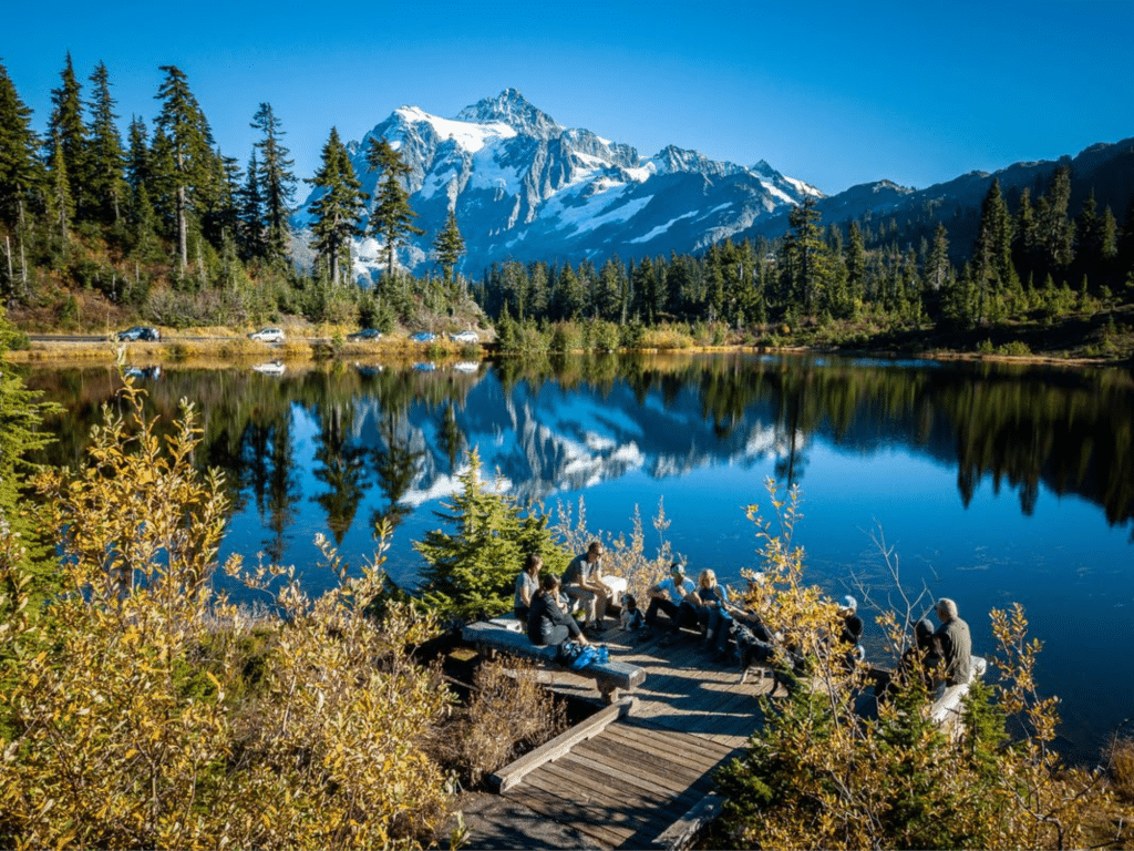
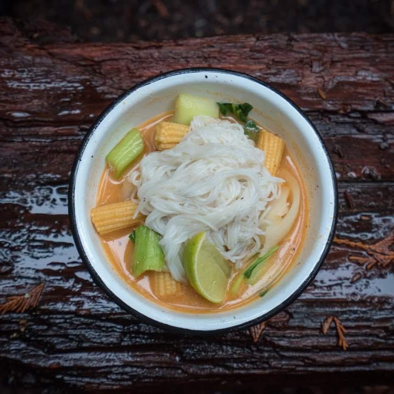
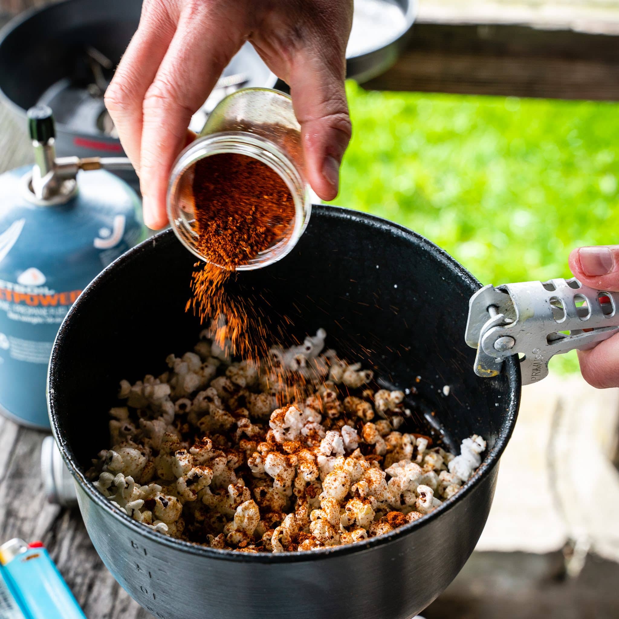
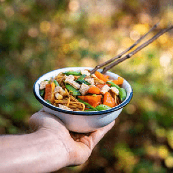
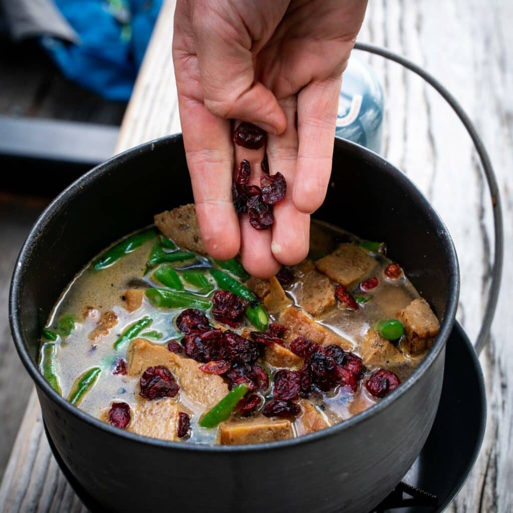
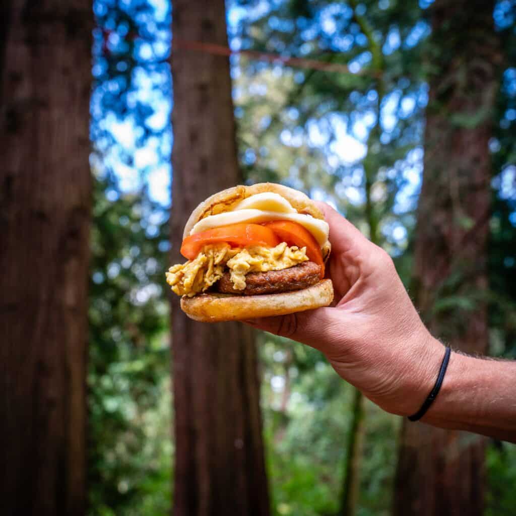
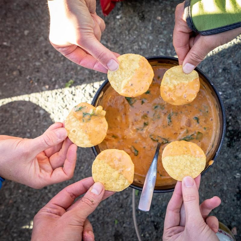
What I also really admired was Alex’s work with drones. It was 2017/18 and drones were just in their infancy for their use in photography and video and I was REALLY intrigued by adding that element to the website and social media content. Here are our first 2 creations.
Pretty awesome!
Alex and I eventually worked together over multiple weekends and projects from 2019-2021. He also helped create, film and edit our kickstarter video for our second cookbook. We have hundreds of shots from our work together and he was an absolutely integral part of helping get Outdoor Eats off the ground.
While Alex and I were meeting up on the weekends, I started to work on a company name and logo package. When I first decided to create a company focused on outdoor eating, I knew I wanted the look to be classic and approachable with some element of color. There are a lot of outdoor companies out there and many of them use a lot of with trees, mountains, blues and greens, and I like a lot of them. But I wanted something that was slightly different, without being too abstract or even a cookie cutter copycat.


I have had a philosophy in the kitchen that I have followed for a long time. I call it “familiar yet different.” Why I think this is an important philosophy is that it’s able to harness creativity that leads to interesting, exciting and tasty meals without being too wacky or off the wall.
One is example I created a while back in the mid 2010s when I was a research chef was Pomegranate BBQ sauce. BBQ sauce is classic in many regions. Pomegranate was this hip new “super food” that not many people had enjoyed. With the addition of pomegranate juice to a mellow BBQ sauce you get a nice upgrade in color, sweetness and tang that’s a little bit different. It also compliments the flavors that are already in the recipe and sets up for repeat bites and enjoyment.
In contrast, here is an example of a product launch that was just too “out there.” Habanero IPA beer. This beer sounds fun in theory and it may be enticing to try, but it eventually falls in the novelty category where you buy it one time to try it, but don’t purchase again. It’s not an approachable enough flavor to keep you coming back for more.
Familiar yet different leads you into new and interesting flavors that you may not have wanted to try before in a soft landing zone of something that is approachable and already familiar to you.
I took that same philosophy to the art and logos for Outdoor Eats.
Ronald Viernes
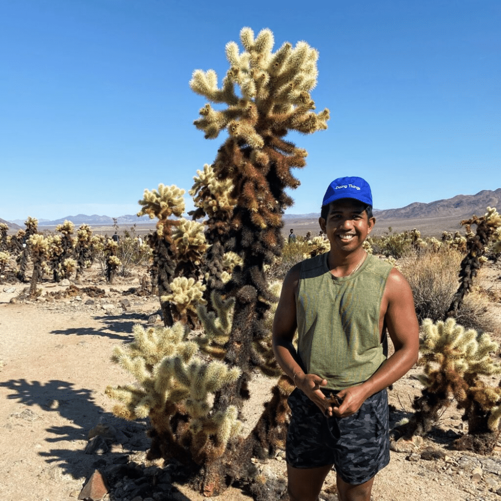
First off, I needed a designer. I queried some of my design friends to see if they wanted to help but none of them had time to fit in my side project into their busy full time job. These queries led to a friend of a friend Ronald Viernes. He liked the idea and vision and most importantly, he had time in his schedule to work on the project.
He had many years of experience designing logos and websites for many companies which made me feel good. He lead us on a project plan through designing the logo and brand package for the company over a 2-3 month period. No small fleet.
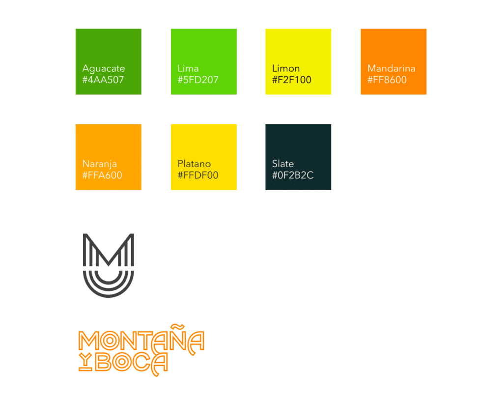
As some of you may know, the first name of the company was different than it is today. I rebranded in 2022 to Outdoor Eats from MONTyBOCA. MONTyBOCA is a Spanish combination of mountain and mouth because I went into the mountains and I eat with my mouth. Actually, the first REAL name of the company was MONTAÑA y BOCA. I quickly shifted to MONTyBOCA as some of my close friends couldn’t say the company name properly. Lesson learned. For colors, we wanted to shift away from the classic greens and blues and have a little fun. We landed on 3 main colors and sub colors to go with plus a logo mark. This provided some flexibility to play around with the pallet as we went into creating logos, a website and cookbooks. Here are some of the early logos. Classic. Solid. With a little bit of interest in the lettering and font.

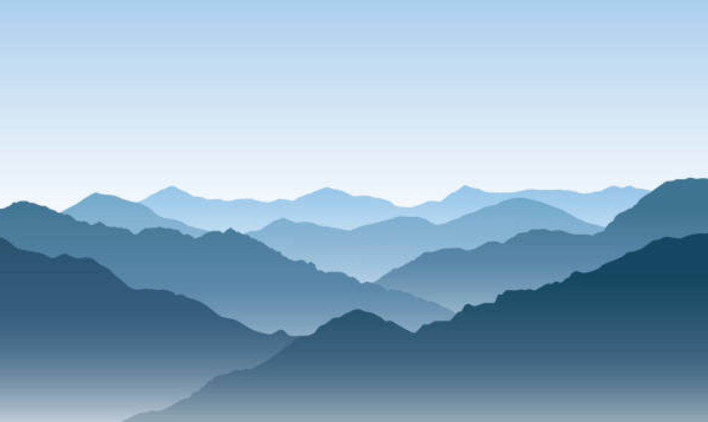
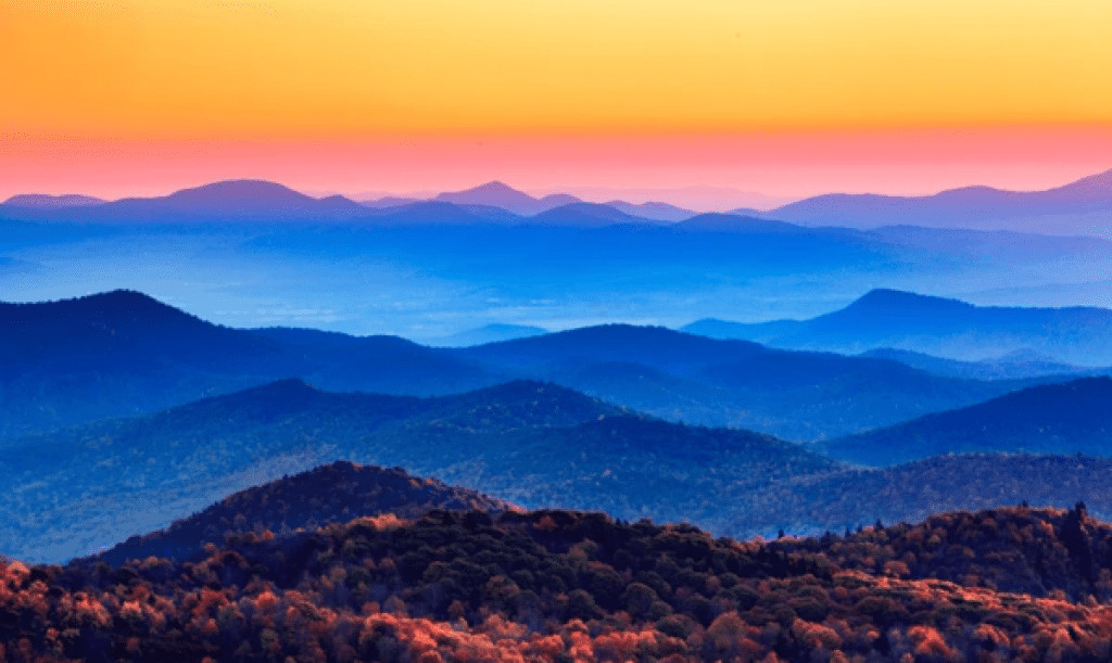
We started to explore mountain ridge lines as a theme as well. This company is based outdoors and was spawned in the mountains of the Pacific NW, so it seemed like a natural fit. I have also loved the look layered ridge lines give in different regions of the country. Below are a couple classic photos/paintings with the layered blue and gray scales of ridge lines at sunset and twilight. We wanted to play around with our new color scheme to see how they could compliment.
Part of this early design exploration was our recipe cards. I wanted to have as much information as possible in one card, while not being too busy. So while the cards aren’t stylistically complicated, they are well thought through for ease of understanding the information. At the beginning, I thought most of the content was going to be posted on Instagram, so the first recipe formatting was a square. We then quickly evolved to the vertical rectangle that could work in the dual formats of a cookbook page as well as a smart phone without reformatting.
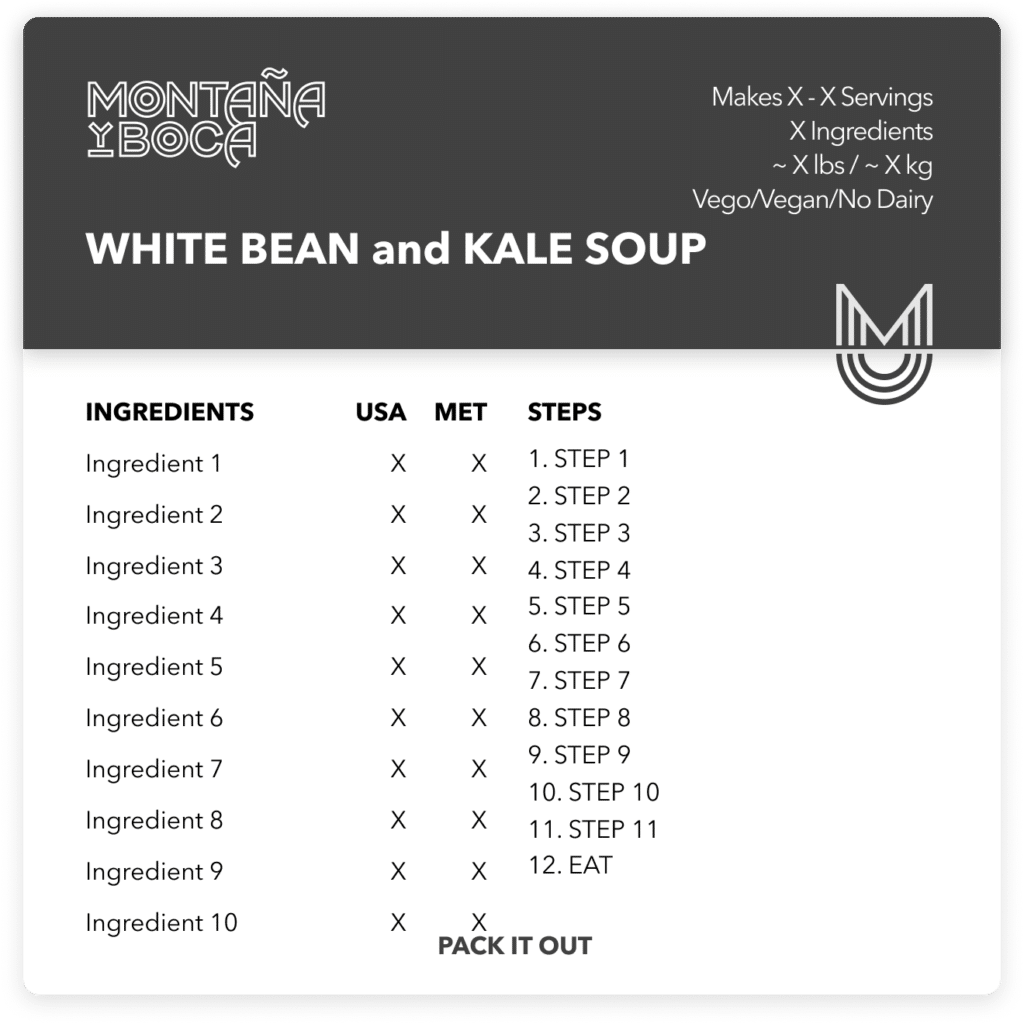
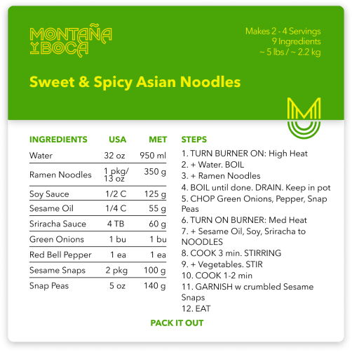
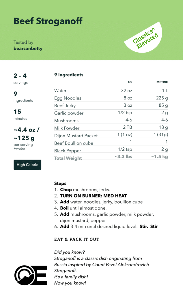
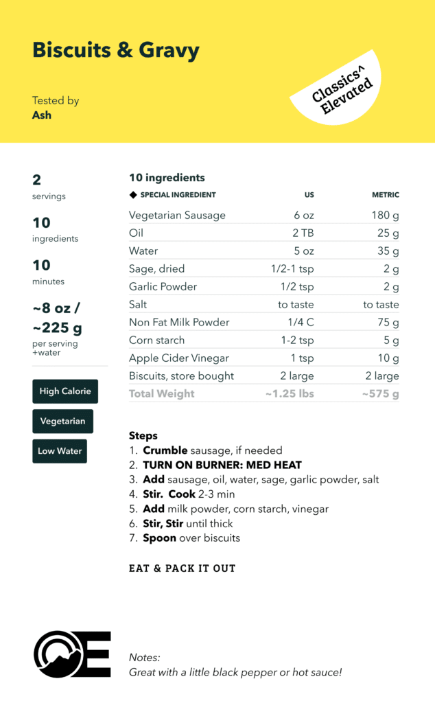
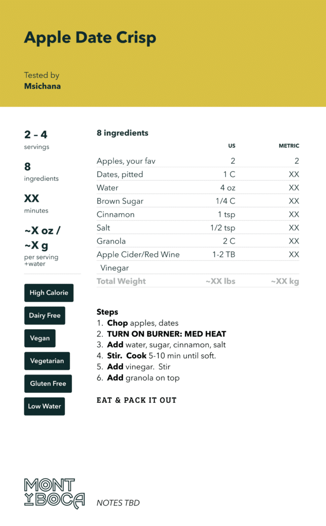
After we finalized the colors and logos for MONTyBOCA we dug into designing a cookbook.I had never designed a cookbook and I quickly learned that there is a lot that goes into it. Not just recipes. Not just photos. But formatting of pages, making sure spacing is correct so nothing gets cut off and eventually editing, editing and more editing. Minding for typos, colors or anything that just looks a little bit off.
Trail Meals – Origin Edition – 2019
It all starts with one and Origin was the beginning. Through the early brand and logo exploration Ronald was able to create some fantastic ridge line layers, using different color treatments. I loved the use of the different colors, rather that dark blue/grays or sunset colors.
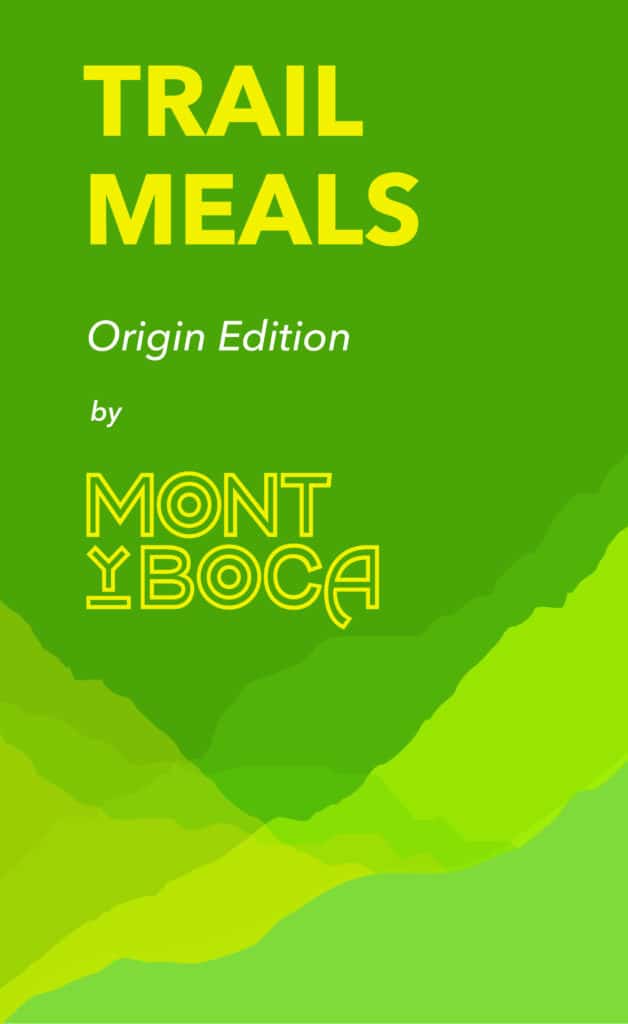
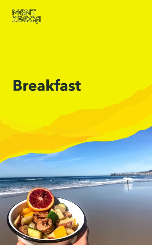
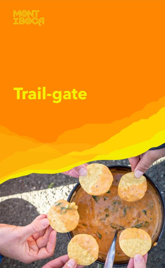
Once we decided to extend the Trail Meals series, we explored different color combinations that would still provide that familiar yet different philosophy, while differentiating each edition.
Trail Meals – Vista Edition – 2020
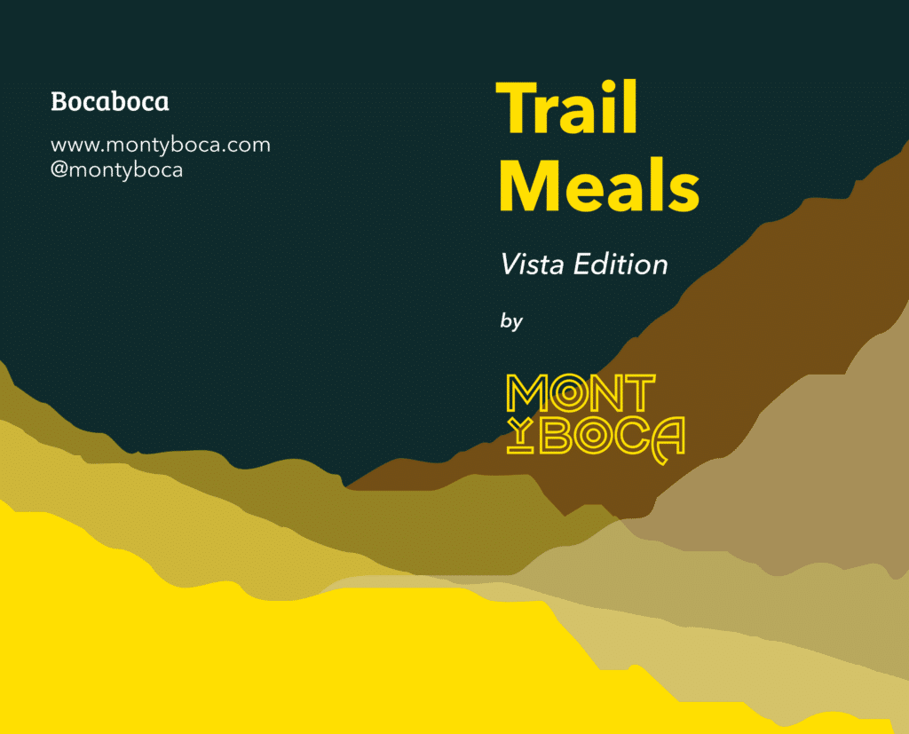
Kickstart Campaign – Fully funded
Trail Meals – Wander Edition – 2021
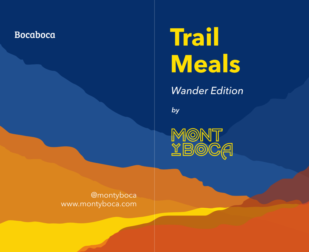
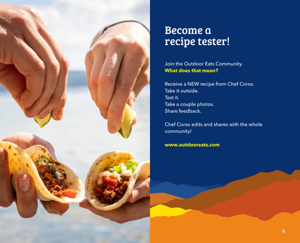
Company rebranding 2022
Not just one designer has helped make Outdoor Eats a reality. As the company has evolved, so has the needs. As we continue along in our design/art story, we have other designers and artists that have provided a lot of support.
Stephanie Jung – graphic design
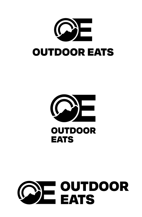
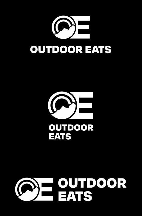
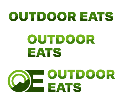
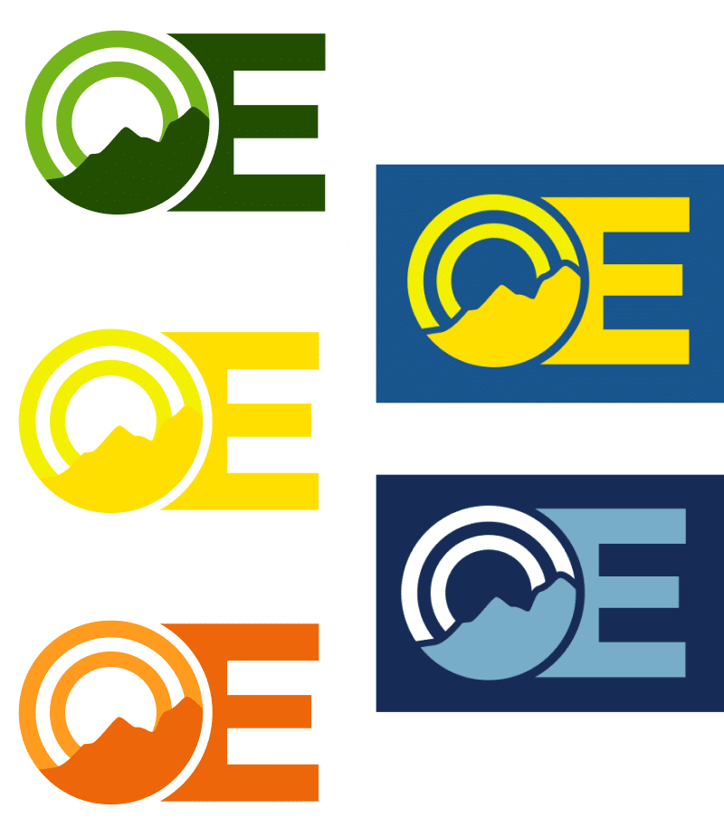
When the decision came to rebrand MONTyBOCA, (no small decision let me tell you) we needed new everything. Logo, colors, font, all of it. MONTyBOCA was good and once people understood what it meant, they got it. But it required some layers of explanation that I wanted to eliminate. I partnered with a new designer, Stephanie Jung out of San Francisco, CA. We workshopped ideas together over a few months and eventually landed on the below. A new bold and easy to read font choice and solid color scheme. I also wanted the logo to be able to play around with different colors in the lettering. Looks pretty nice to me! Stephanie did an awesome job. stephaniejung.com
New cookbook art
As the Trail Meals series progressed through the last few years, we had exhausted the Ridgeline theme. It needed to evolve. That’s part of any design project. During this time in my life, I was going through some tough relationship stuff and I set out on the road on the vagabond tour around the country, living and working full time on the road. (The tour is still going strong after 3+ years) I felt like my life was a river. Ebbing and flowing along. Sometimes aggressive and raging, other times calm and meandering. But always moving forward, never stopping.
After working through the first few editions from the naming and art perspective, I wanted to shift to some other imagery. Rivers have always been a favorite spot for me to sit when outdoors. I like the sound, the look of the different rapids, the fact they can look very different in different seasons, and the fact that they keep going. They help me find calm, remind me to keep going and think that my life would meander as it needs much like a river. Art imitates life, life imitates art as they say.
With rivers as the new theme, I hit up Roland again for new project. This time, we created and developed the art for 3 editions at the same time, finding imagery, style and colors that we felt worked. If you’ve never worked on a design project, you are missing out. They can be really fun and I love the process. Here’s an example of how they work. And the whole goal is start high level, or top of the funnel and hone and hone the idea until you are working on fine point details.
Idea Stage
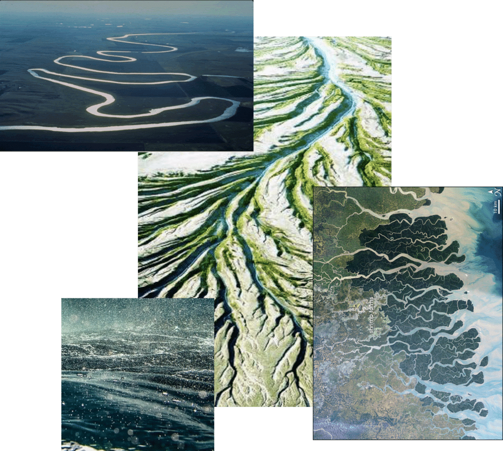
We started by creating a big mood board of river ideas, photos, paintings, shapes, sizes and colors. With the river theme, I was fascinated by different pictures/photos of rivers that are out there. Water colors, heavy painted rapids, impressionist, aerial shots, floodplains and so much more. What we landed on was a specific angle of perspective of about 30 degrees. This provided some room for movement and negative space for text and information.
Drafting stage
We moved to the drafting stage. A little bit farther down the funnel of creativity but still not getting too detailed. The three river styles we landed on were meandering, the delta or flood plain entering a river and rivers coming together/convergence.
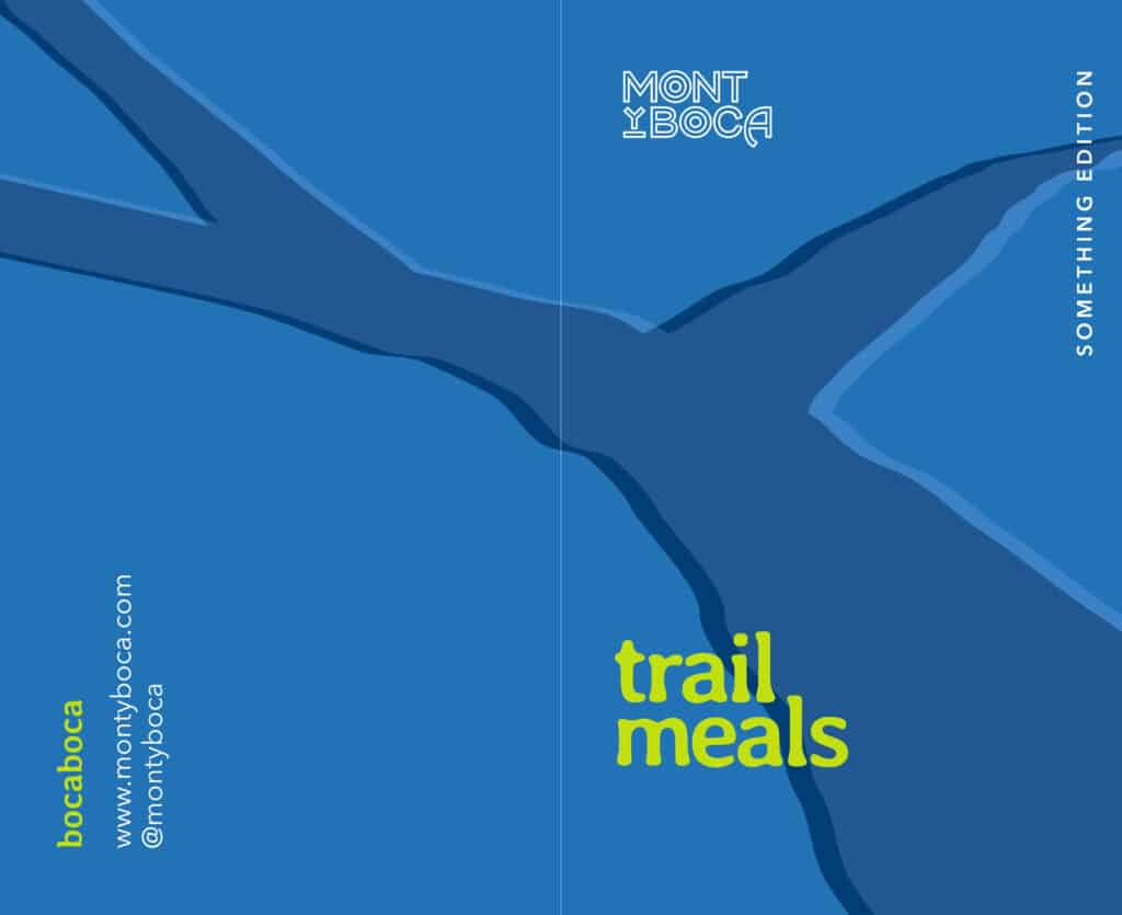
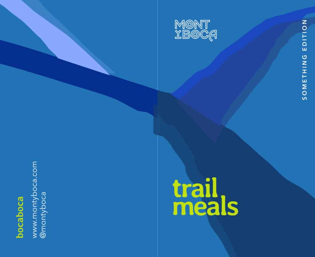
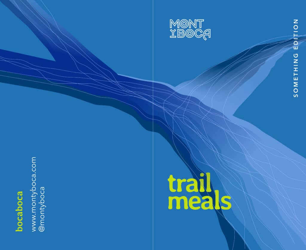
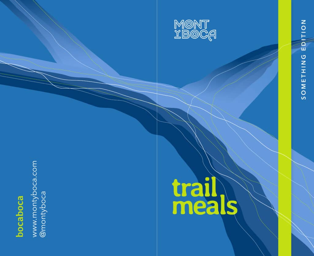
Here are a few of the early drafts for our river theme:
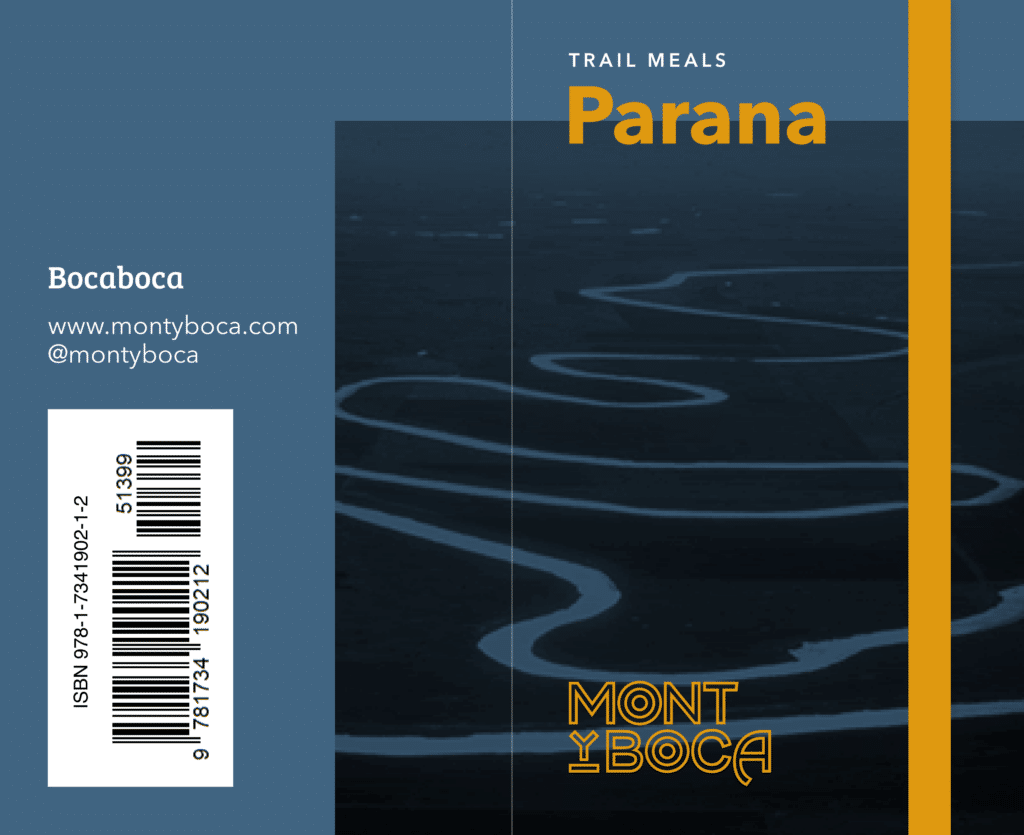
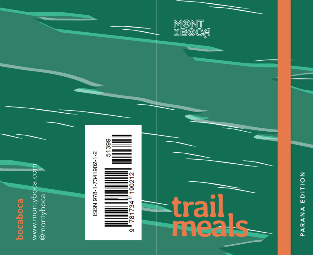
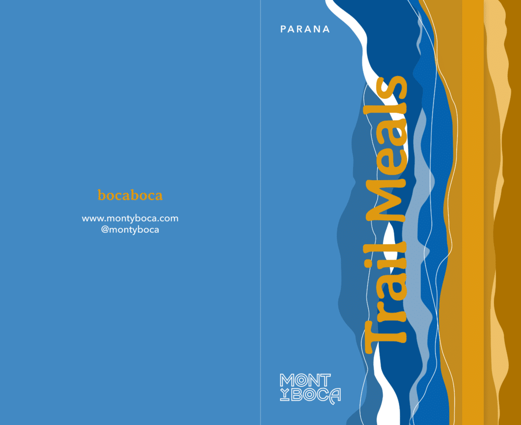
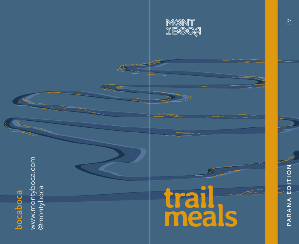
There were some interesting elements to draw from in the first round of drafting but none were quite perfect. Which is very much part of the process. As we progressed, the art started to take shape. After 5 or 6 rounds of drafting, we found our art. Delta with the alluvial fan river art came together pretty quick. Riverbend with the meandering river theme as well. We just need to tweak and shift where the river was moving to accommodate the text.
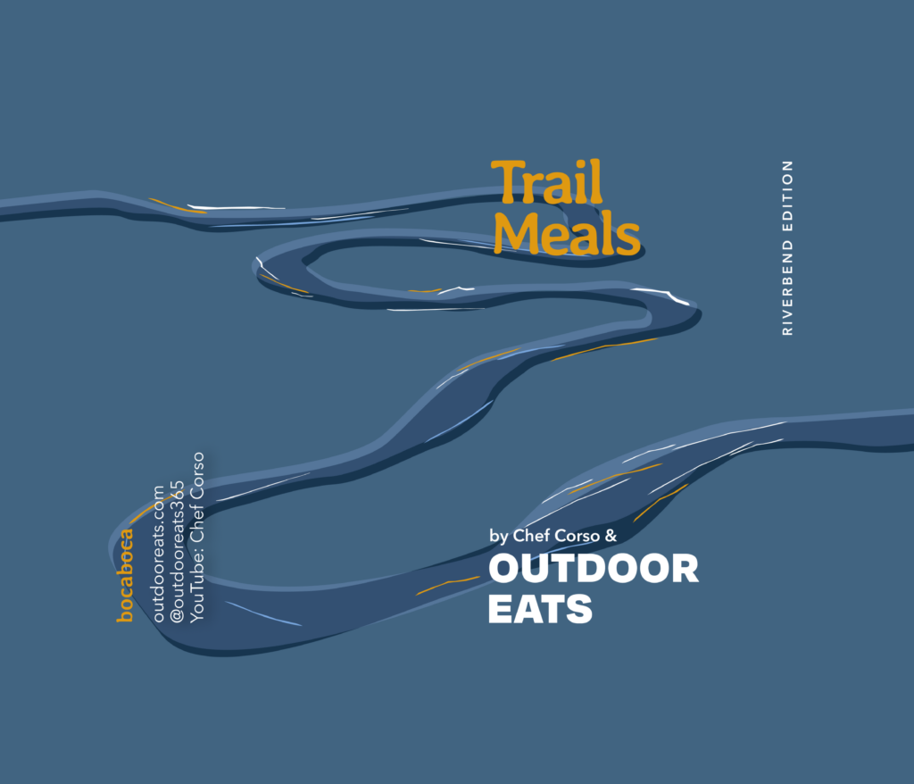
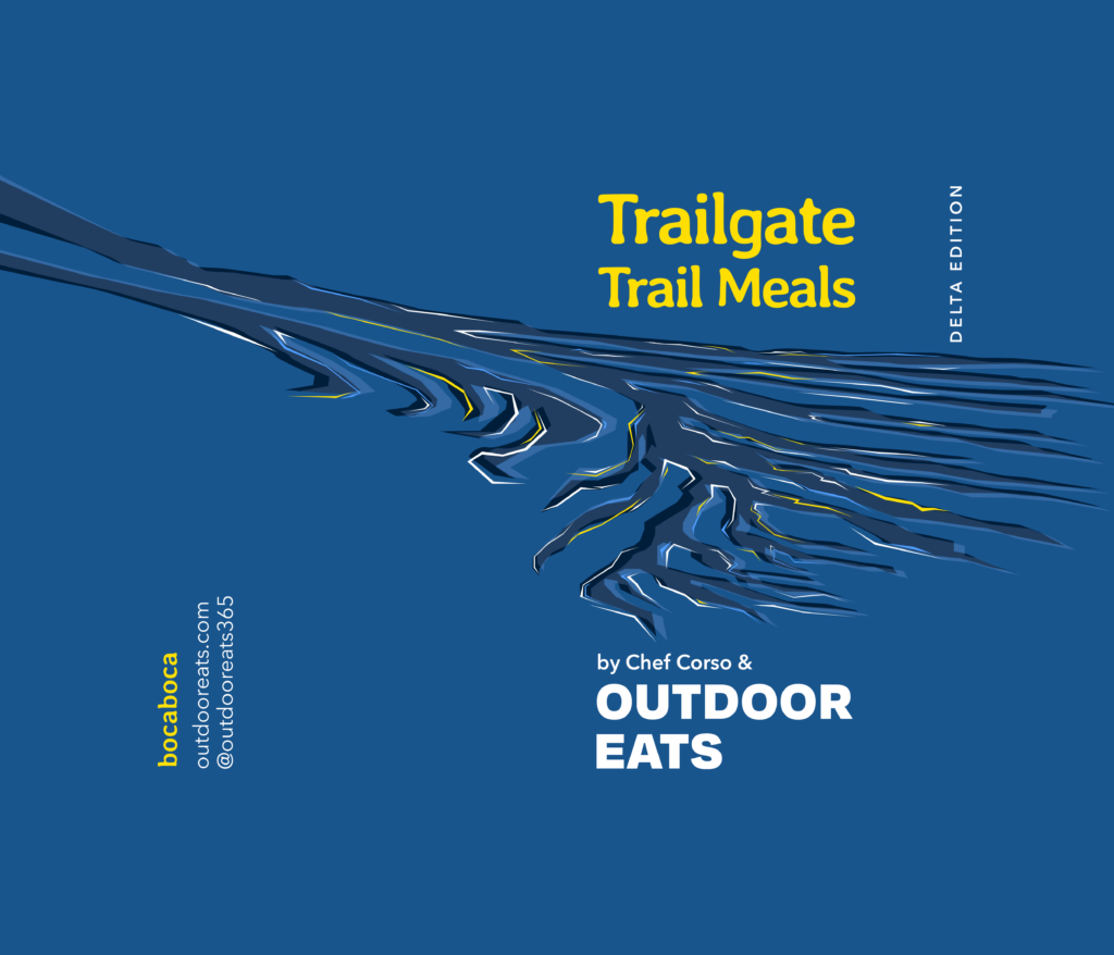
The third and final river theme was not the case. It was really hard to get exactly the look and feel that we wanted. I really liked the idea of converging rivers in some way. But I also wasn’t really keen on having the art mimic “Bob Ross style” fluffy rapids. We went through multiple rounds of drafting and workshopping but we finally landed on something that I was proud of.
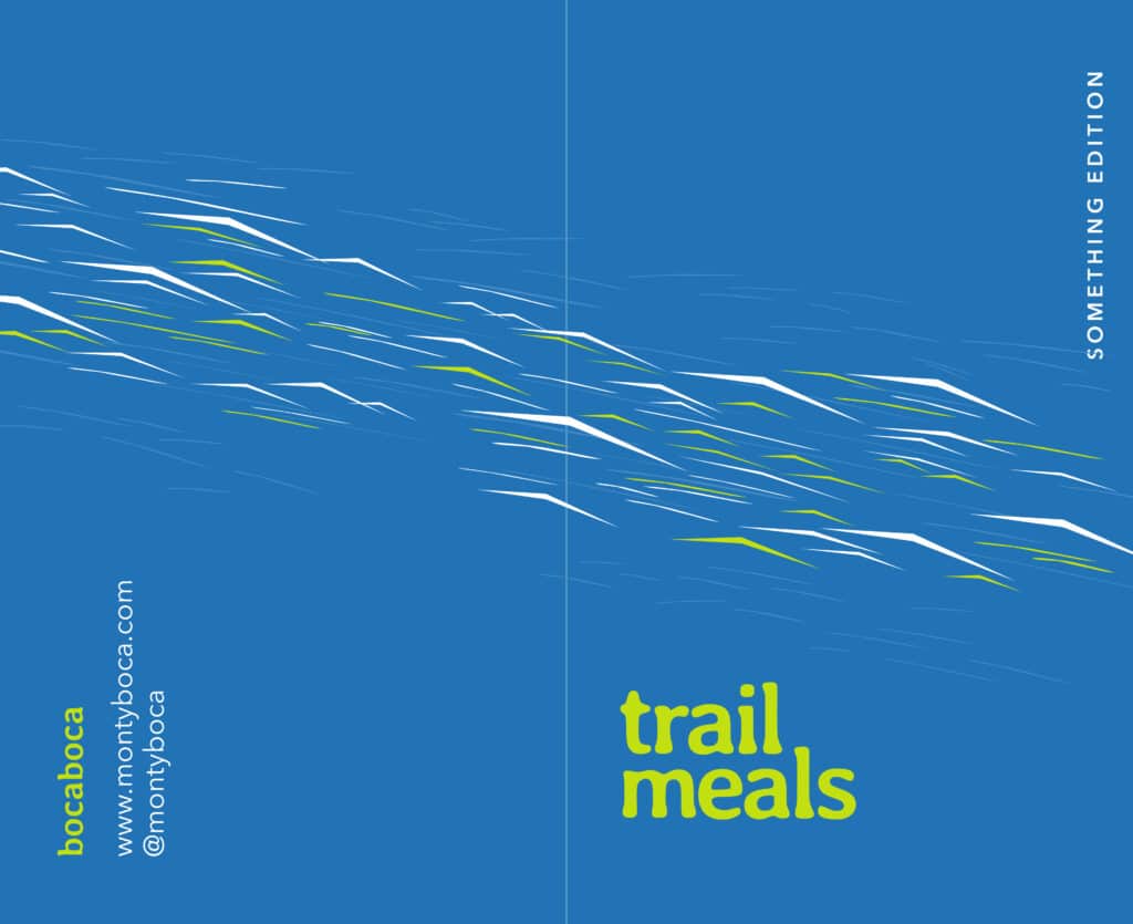
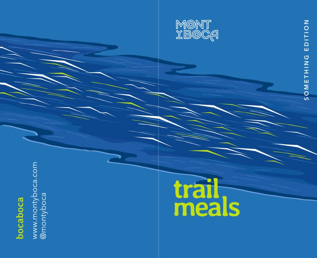
Trail Meals continues
With a new brand, logo and cookbook cover art I thought it would be a great idea to release 2 cookbooks in 1 year! Two is better than 1 right..? Part of this reasoning was that I wanted to release a plant based cookbook. I personally enjoy all kinds of food and do not have a specific dietary restriction. But I know that the vegetarian, vegan and plant based communities are very underserved in the outdoor meal space. Just eat peanut butter and tortillas they say…but there are so many more tasty options available and I wanted to share that.
Trail Meals – Terra Edition – 2022
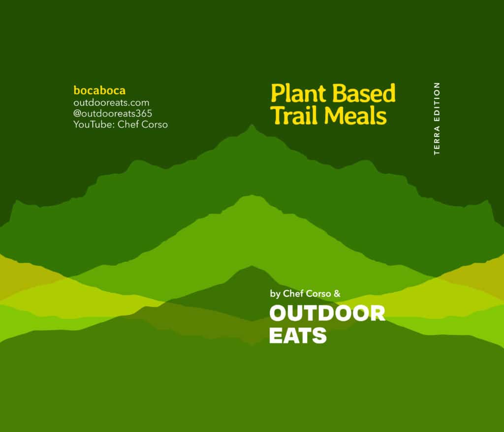
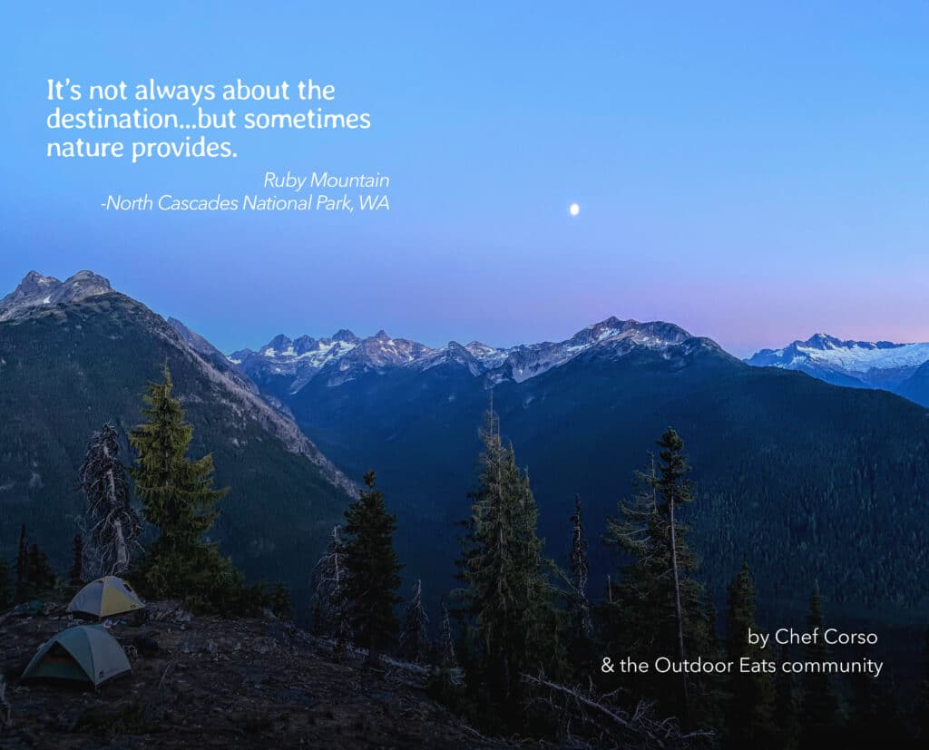
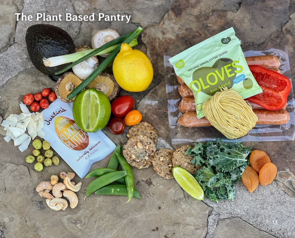
Trail Meals – Riverbend Edition – 2022

Video editing, cookbook editing, and more photography – 2022/23
Besides Alex, Ronald and Stephanie, I have been able to collaborate with a few other creatives over the last few years. All of them have provided valuable style and input into creative ideas, video editing, photography and more. And they have really taken some hours of work off of my plate so I can go out and explore for the next best recipe location.
James Capozzi – video editing and photography
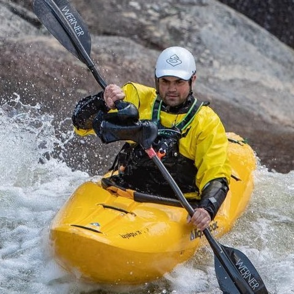
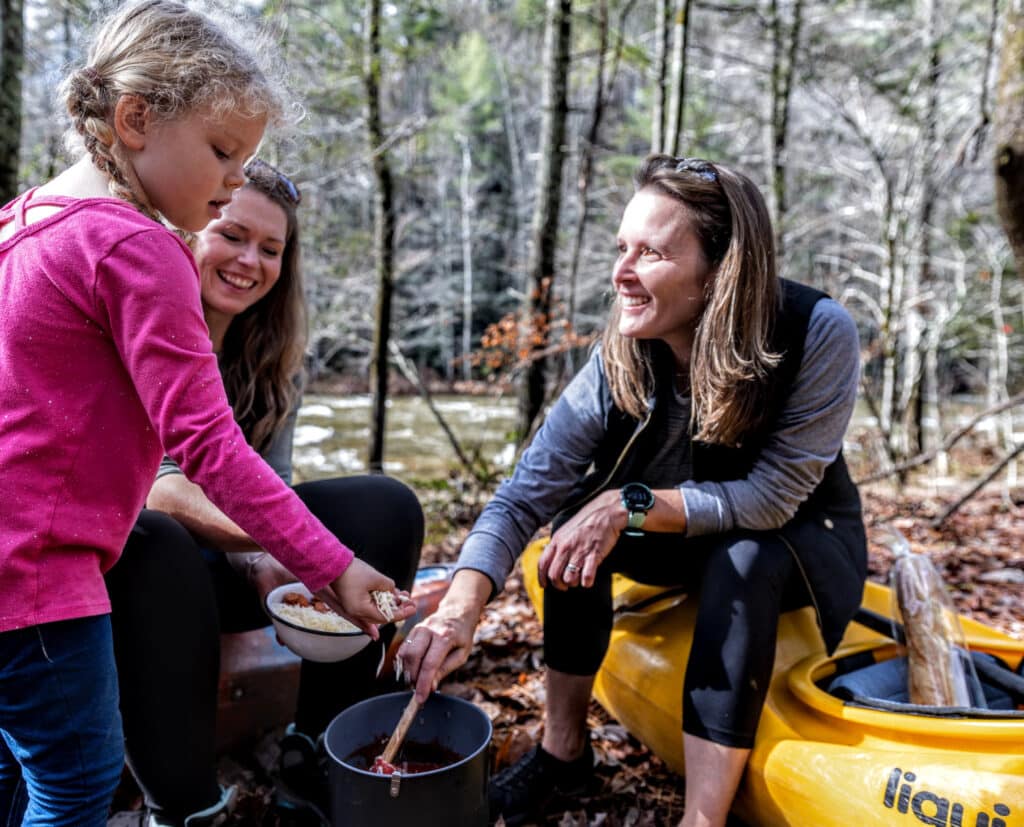
James is an avid white water paddler (he even took me out this year in Charlotte, NC!). He has edited videos for Outdoor Eats as well as provided much of the photography for Trail Meals – Delta Edition. James lived in Gastonia, NC with his wife and 2 children.
Megan Krueger Smith – photography
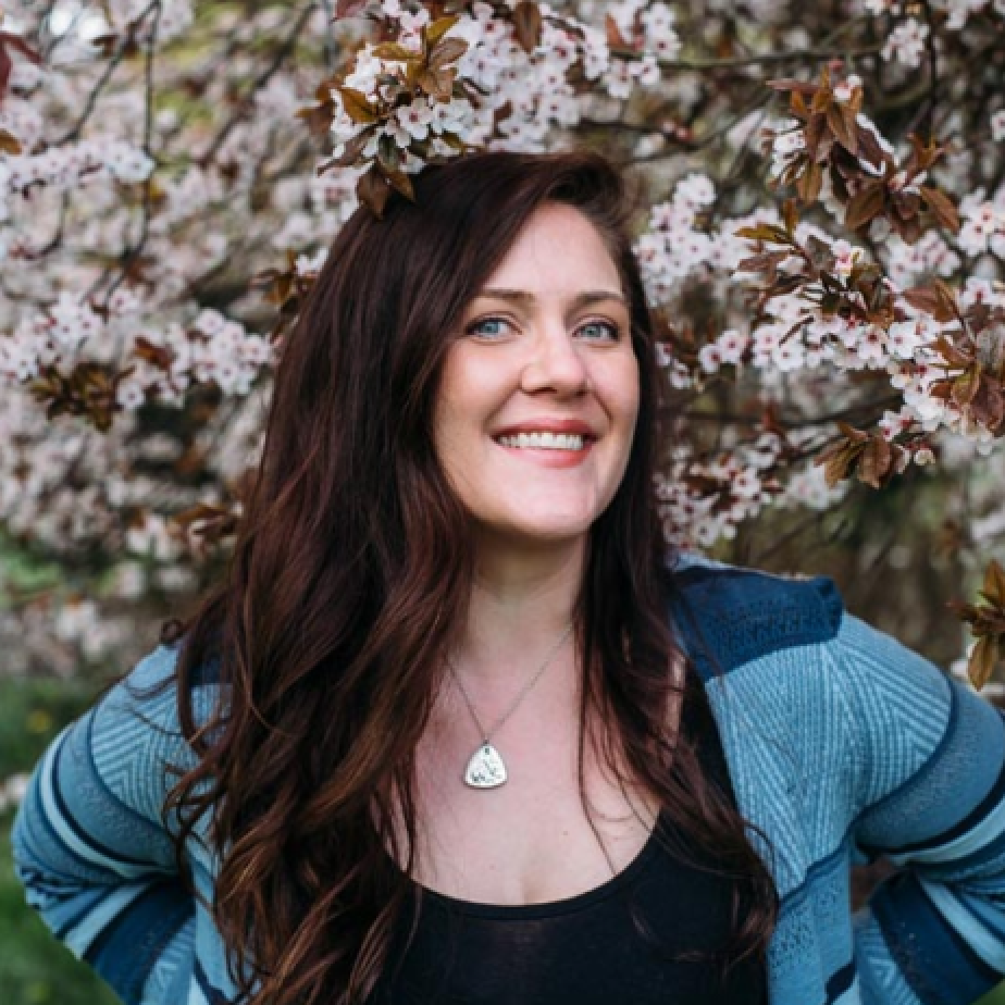
Megan and I have been friends for years. We have only collaborated a few times for Outdoor Eats but her photos are dotted throughout the most recent cookbook editions. Megan lives in Sequin, WA with her husband and son. And all the fur babies and growing family of houseplants. www.mkruegerphotography.com
Roland Mott – photography
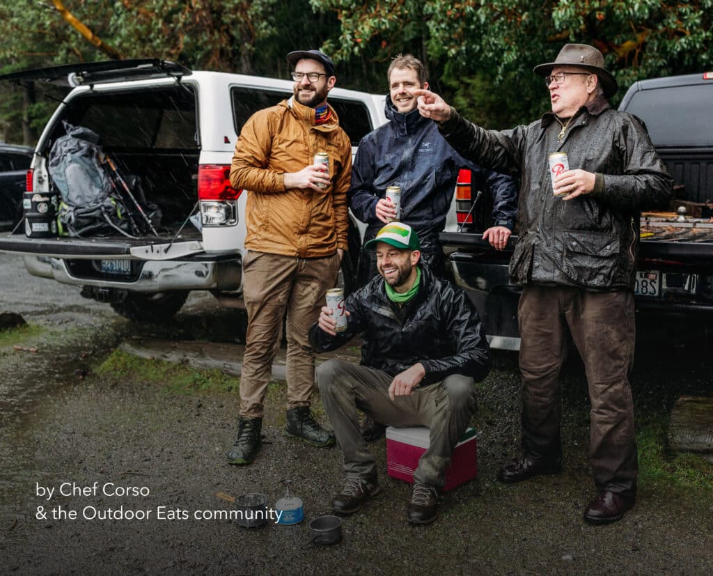
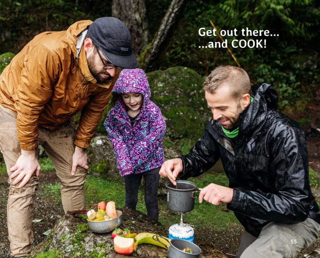
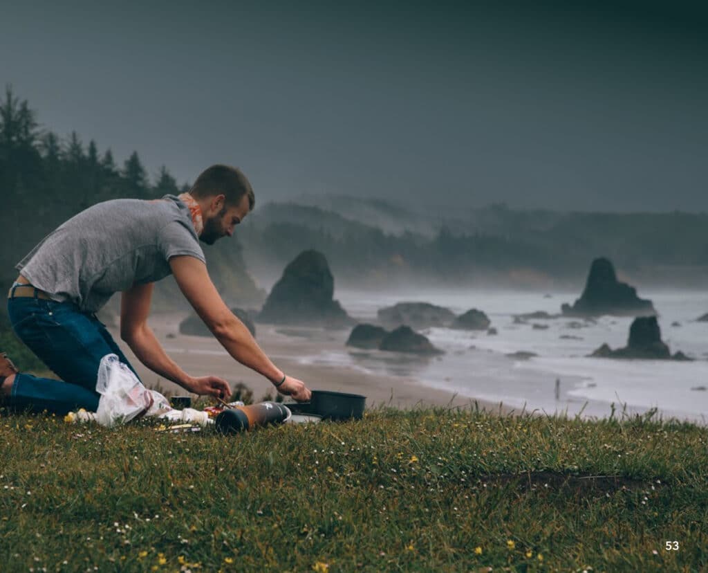
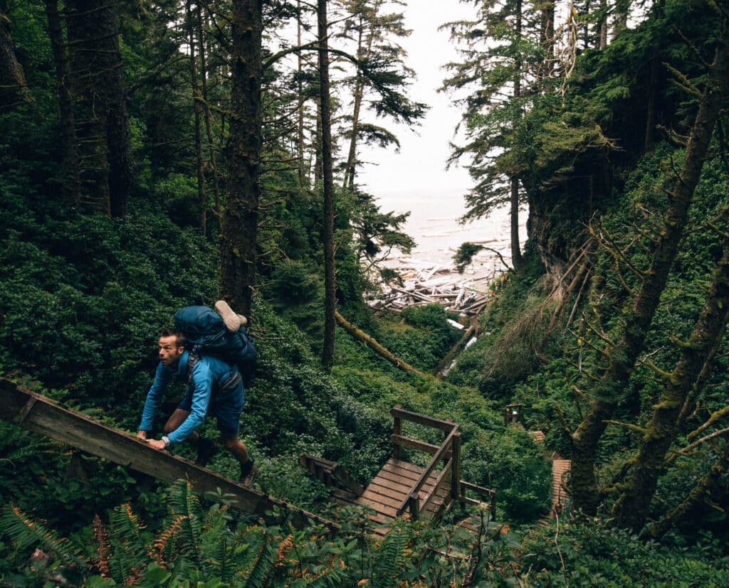
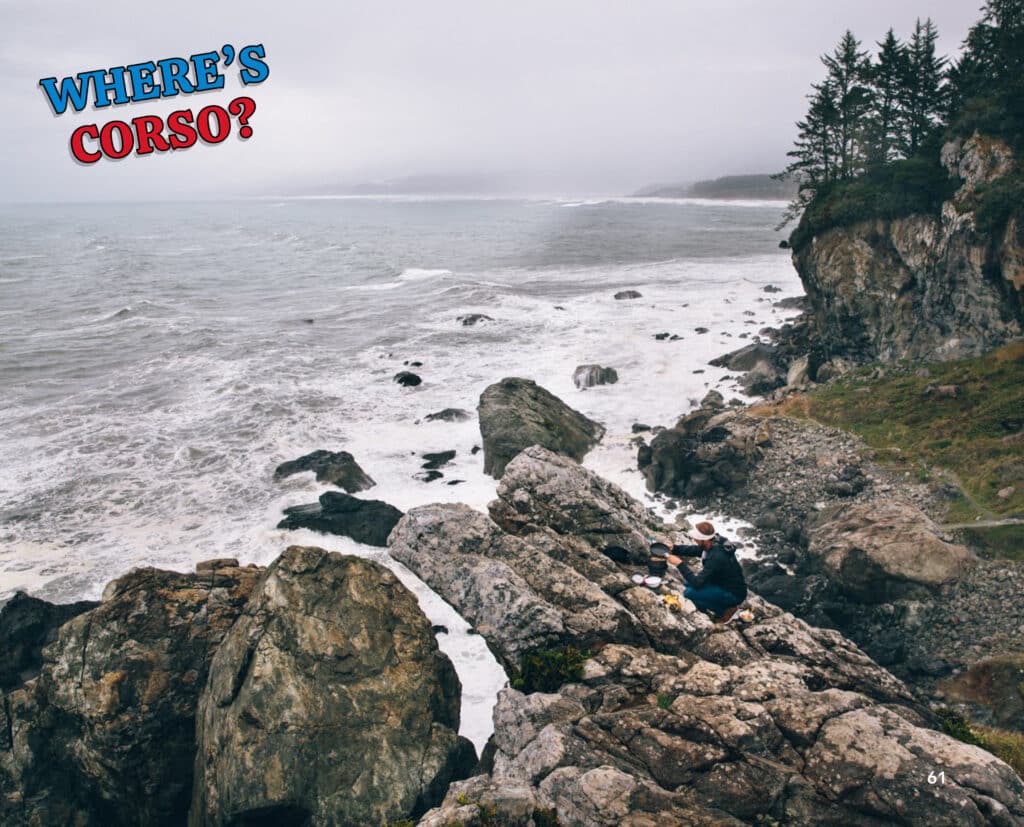
Roland and I became fast friends on a random road trip down the West Coast about 5 years ago. And have since then we have been on multiple adventures. His ability to capture color saturation and scope of place is absolutely stunning. He lives in San Diego, CA.
Sarah Warren & Paul Stanley – cookbook editing
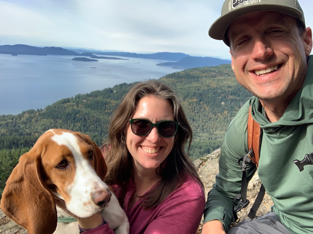
Some other great friends turned creative partners, the dynamic duo of Sarah & Paul have been cookbook editors for just about every edition of Trail Meals. Also recipe testers known as SmoresRAfoodgroup and Guanacojockey. Their detailed eyeballs have been so helpful over the years to make sure we catch all the typos before they hit print. They live in Seattle, WA with their basset hound Lilly Nelson.
Cookbooks 2023
2023 came and it was time for some new editions. I decided on 2 again with the success of 2022.
Delta art was locked in. Cascade needed some work.
Trail Meals – Delta Edition – 2023

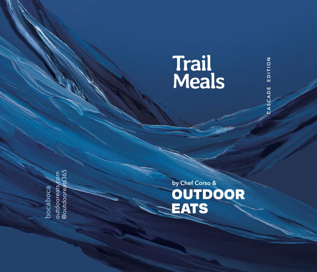
Trail Meals – Cascade Edition – 2023
As I was in development for the 3rd cookbook in the river theme, I felt like there was some room for more creativity. What we had was solid but I thought that there could be something else to explore. So, I reached out to a new artist to see if I could collaborate for some commission work. One day when I was living in Seattle sometime in the late 2010’s, I was walking in downtown Seattle in the Pioneer Square neighborhood. I saw this great, colorful, thick painted mural covering a closed shop. I didn’t think much of it at the time. I just liked the piece. I took a photo and looked up the artist on instagram.
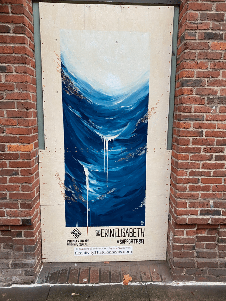
Erin Oostra – artist/graphic design
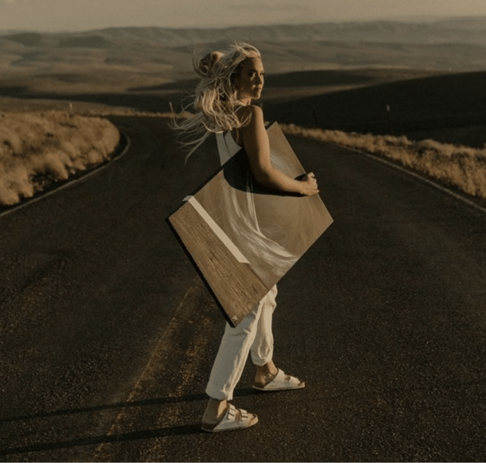
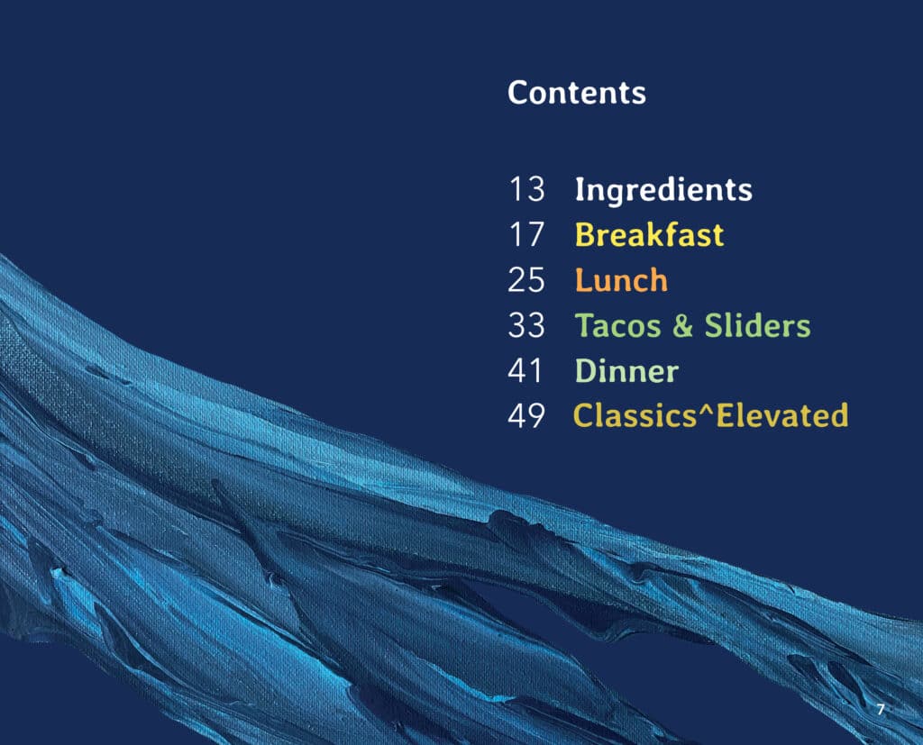
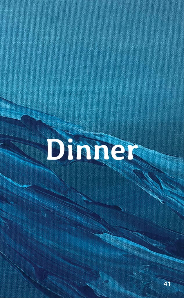
The artists’ name was Erin Oostra and we was a local Washington state artist out of Ellensburg. Fast forward to 2023 and her piece popped into my mind. I love her use of saturated strokes, bold colors and some outdoorscapes that evoke that “familiar yet different theme. I reached out to her and to my delight she was open to the project. I gave her some basic guidance on where we have come with the Cascade art but also wanted her to be free to flow in her own style. Here are some of her other works. You can find her at www.erinoostra.com
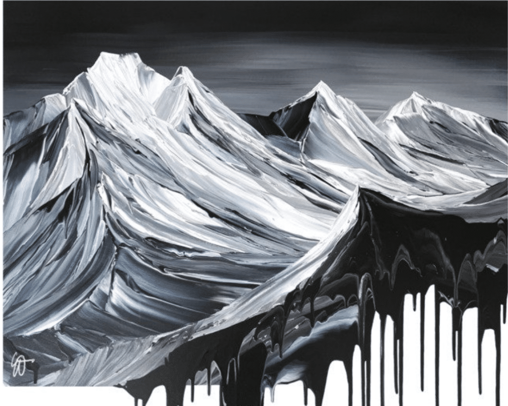
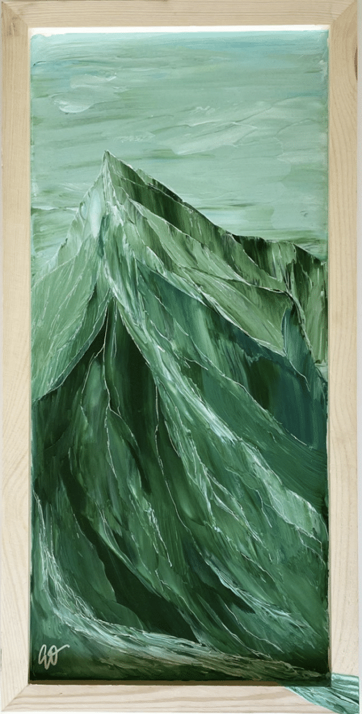
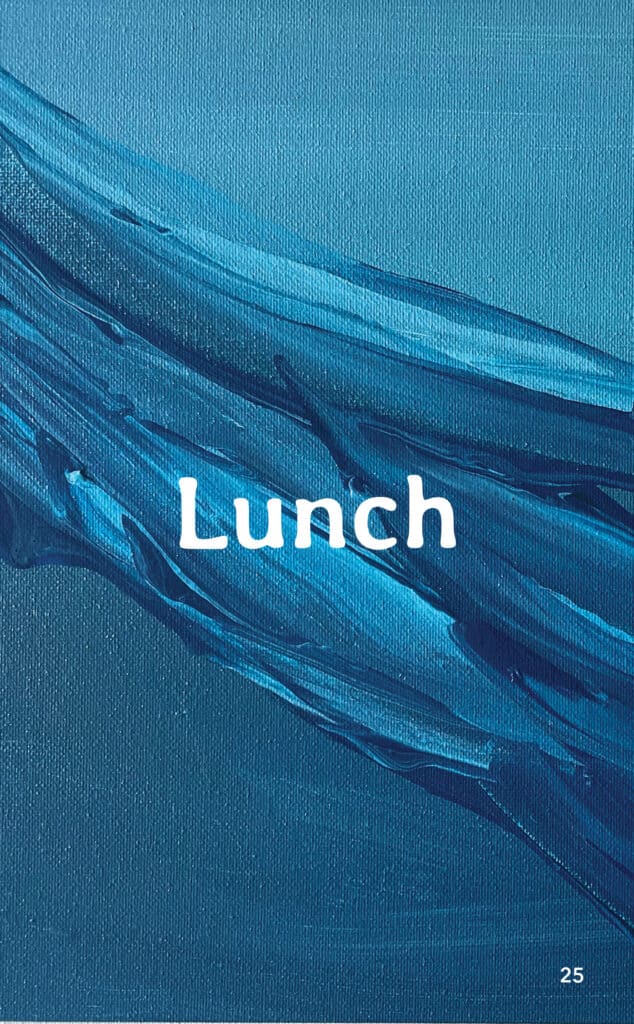
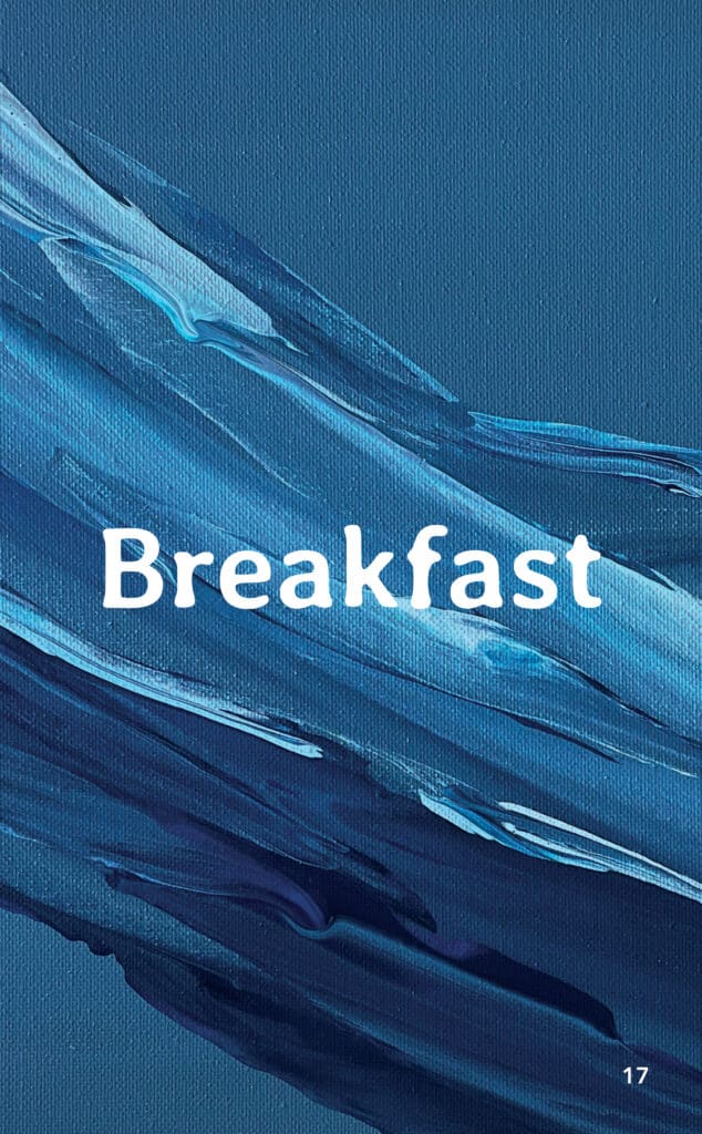
What she came back with was incredible and I loved the direction it was going. What she did was paint the art on a canvas and then take a high resolution digital photo for further work. You can even see some of the canvas texture on the prints! After 3 rounds of painting and design work we had it. The new cover for Cascade. Plus through the rounds of iterating, we were able to use a lot of the art that didn’t make the cover and use for divider and supporting pages. It was a fun and surprising collaboration with a random artist I just saw on a walk around town. I really appreciate her work and her help in honing Cascade into what it is today.
Community support
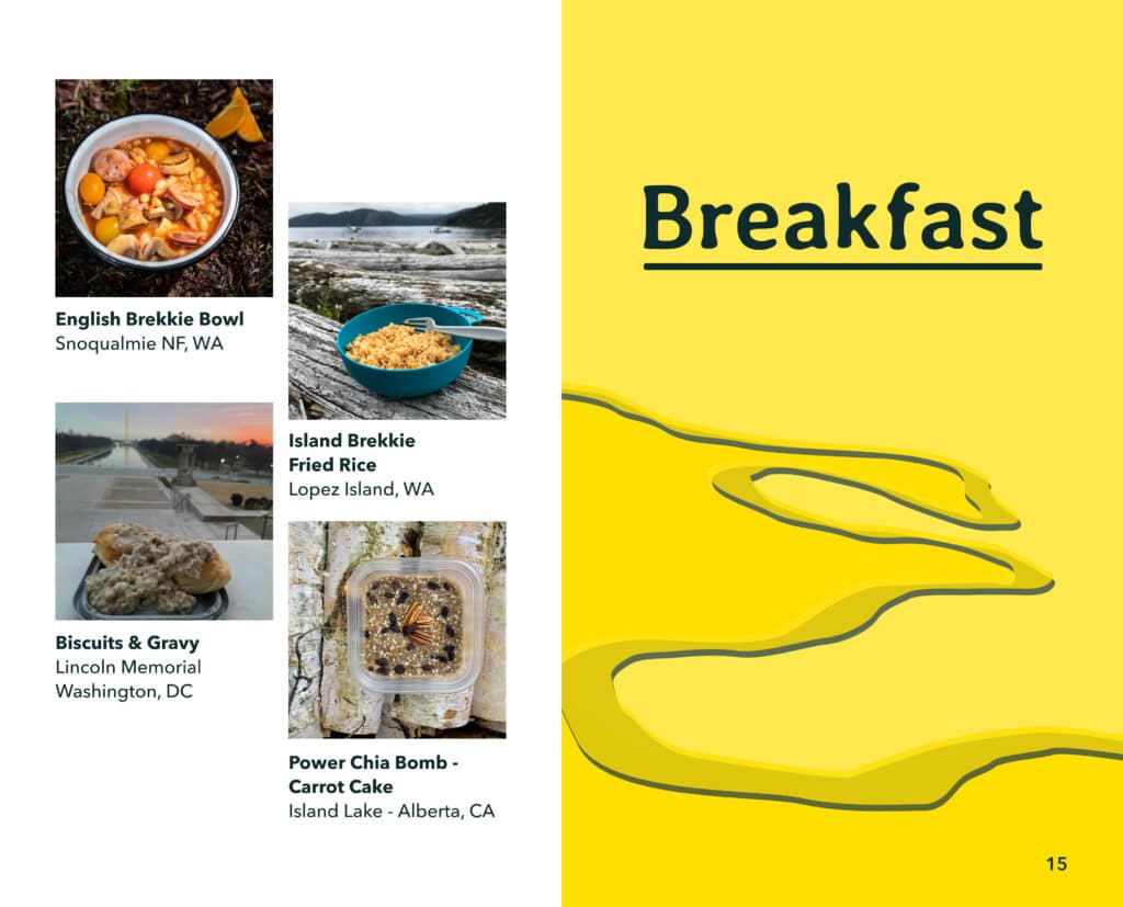
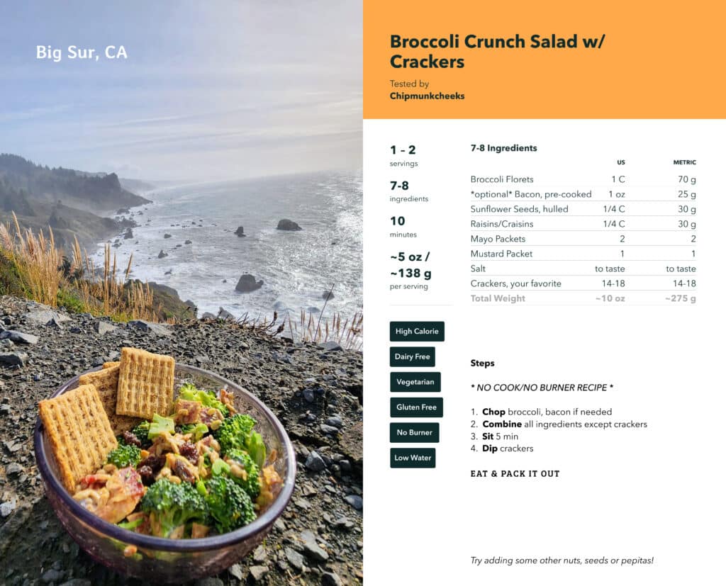
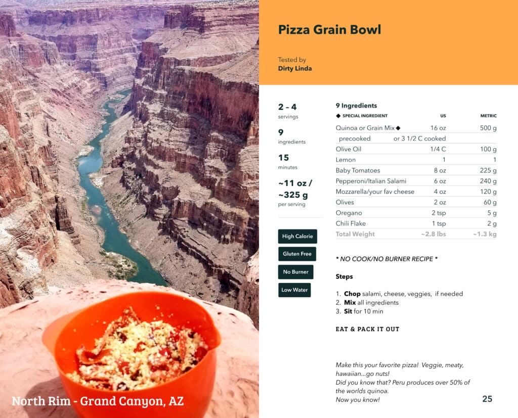
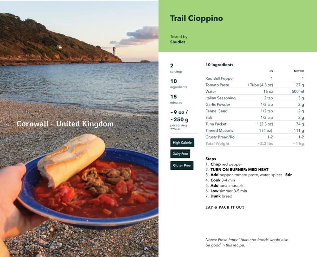
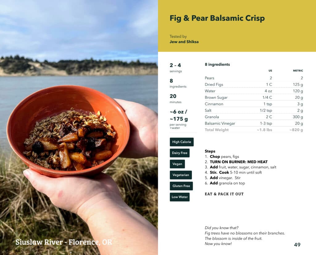
You may be wondering, who takes all of the recipe photos now? When I’m not on an official “testing trip” with a photographer the answer is mostly YOU! The Outdoor Eats community.
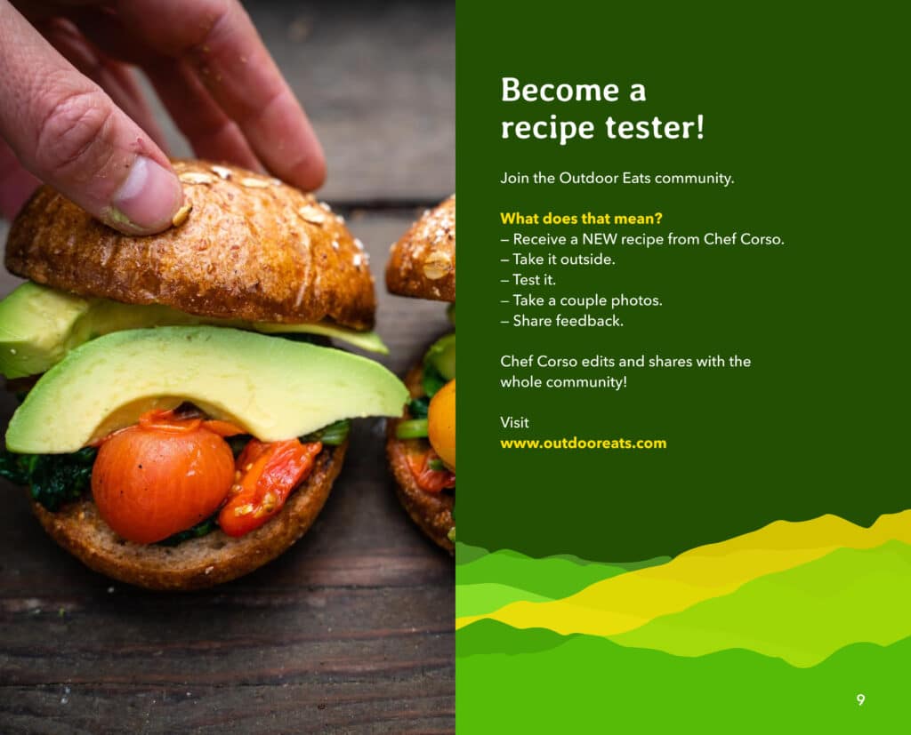
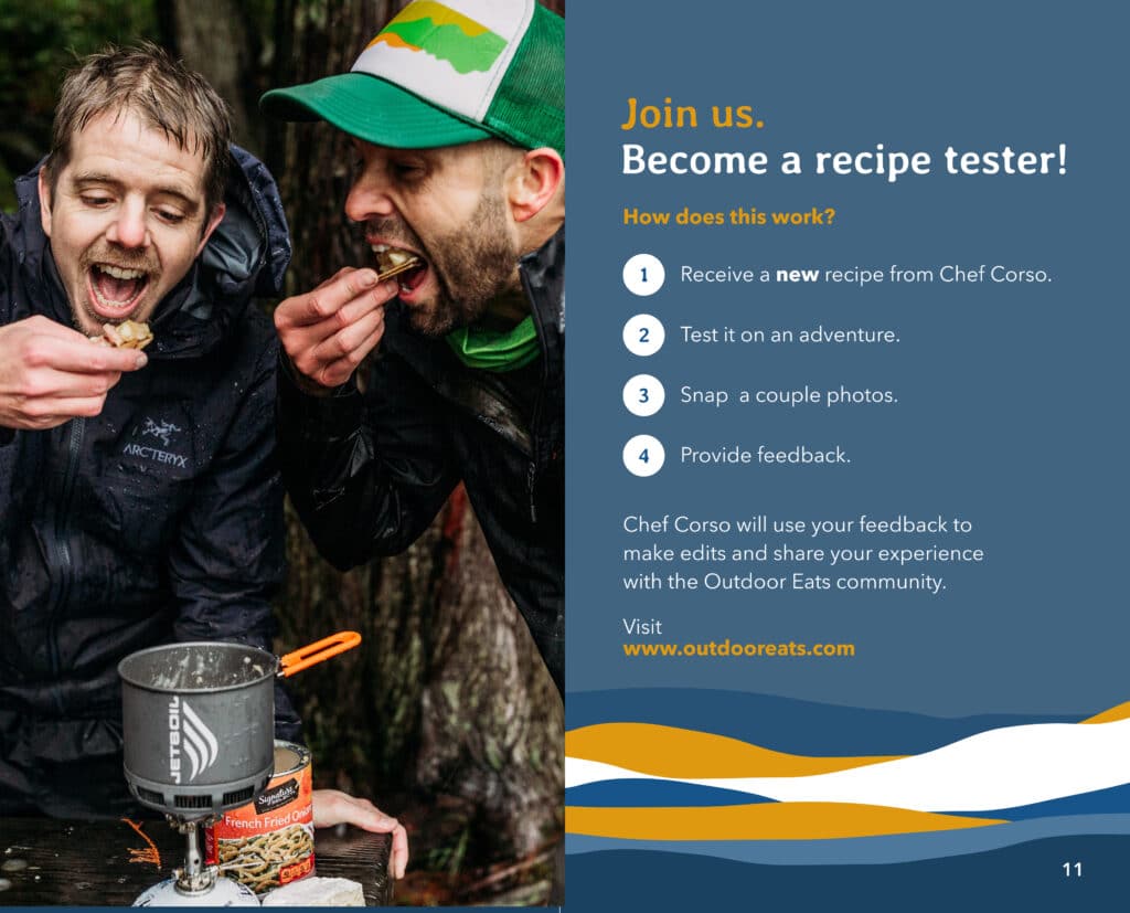
Outdoor Eats didn’t start for me. It started for you. And the Outdoor Eats community has been a huge part of testing recipes and making sure that they work through the years. I also love connecting with folks around the country at a workshop, the trailhead or randomly at a gas station. It was really important from the beginning that community was involved in the recipe creation and testing process. I can go out on outdoor adventures and test all day. But it really isn’t very fun to just cook by yourself. So from day 1, we have had the recipe tester program where folks from the outdoor community sign up and help with the process. The first few testers were my friends and my parents friends that liked to hike. To date, we now have over 800 testers all around the world! It’s really fun to see where people are cooking and how folks enjoy the outdoors in other parts of the country or world. I will fill in and test a few recipes and take a couple photos for social media now and then but most photos are coming from you guys. And that’s pretty great!
Outdoor Eats TV
Heliconia Productions
Outdoor Eats has evolved from a few recipes on a website to multiple layers of creative content. All guided by the mission of elevating the outdoor food experience. Through the years the idea for a television show came up. I thought, “if I’m creating YouTube videos that last 10-20 minutes…where I go out on a hike and adventure and teach folks how to make a recipe, why couldn’t this be a tv show?” Not only could it be a show, it SHOULD be a show. It all didn’t happen in a day or month but over a 2 year period from 2021-2023 I created a TV show pitch, pitched it to multiple production companies, a production company agreed and I gained funding to produce the show. In 2023 in partnership with Heliconia, we produced, filmed, edited and released Outdoor Eats TV to a national audience of over 100 million people on Outside TV an Bally Sports. This is a huge step forward for me and for Outdoor Eats. I am incredibly proud of what we created together and it really shares the mission of elevating outdoor meals in a fun and different way. The crew at Heliconia has been fantastic. From the top down, they are welcoming, supportive and follow through. But I want to specifically call out 2 videographers that were along for the shoots. They were both great collaborators and the Outdoor Eats TV visual and story would not be as good as it is. I thank them both very much.
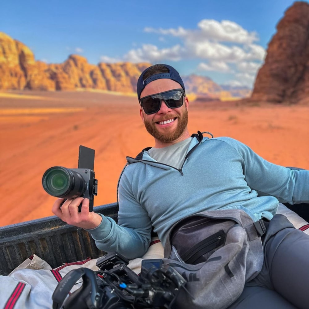
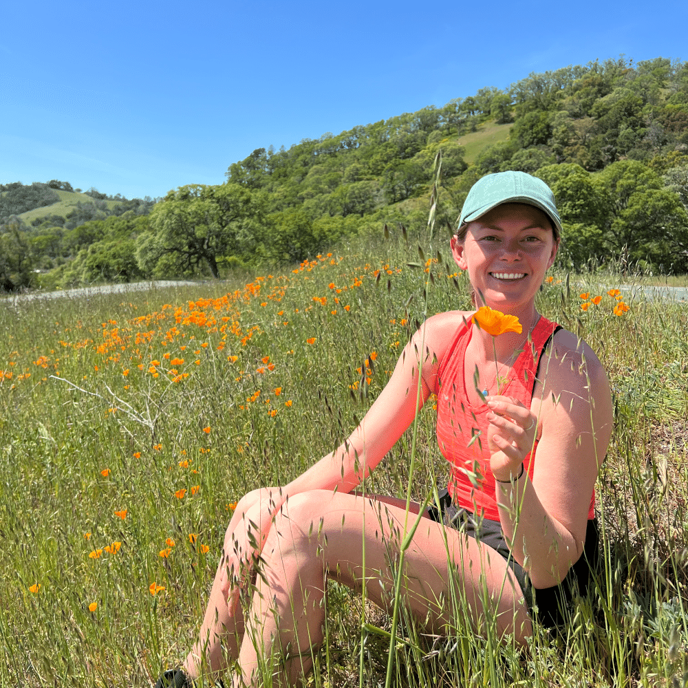
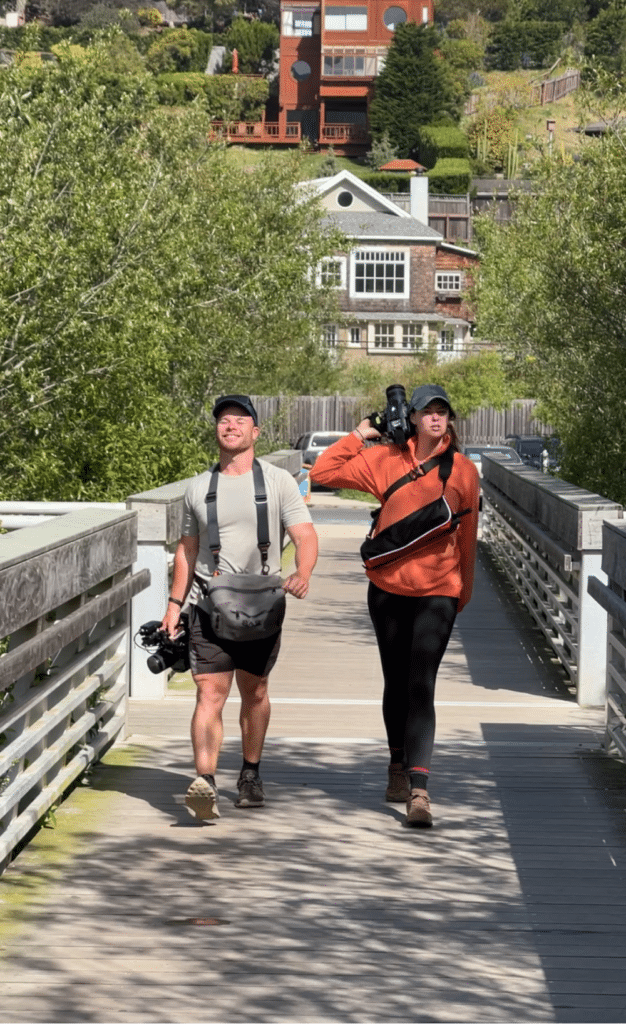
I also want to thank the support team at Heliconia as well. Directors, editors, production assistants, sales and tourism teams for their support in launching this TV project.
We are rolling into production for 2024 as I write this and I look forward to more episodes and adventures with them.
One consistent
Makoto Sebuchi – creative, graphic design, teacher, website UX, cookbook formatting, TV show guest and more
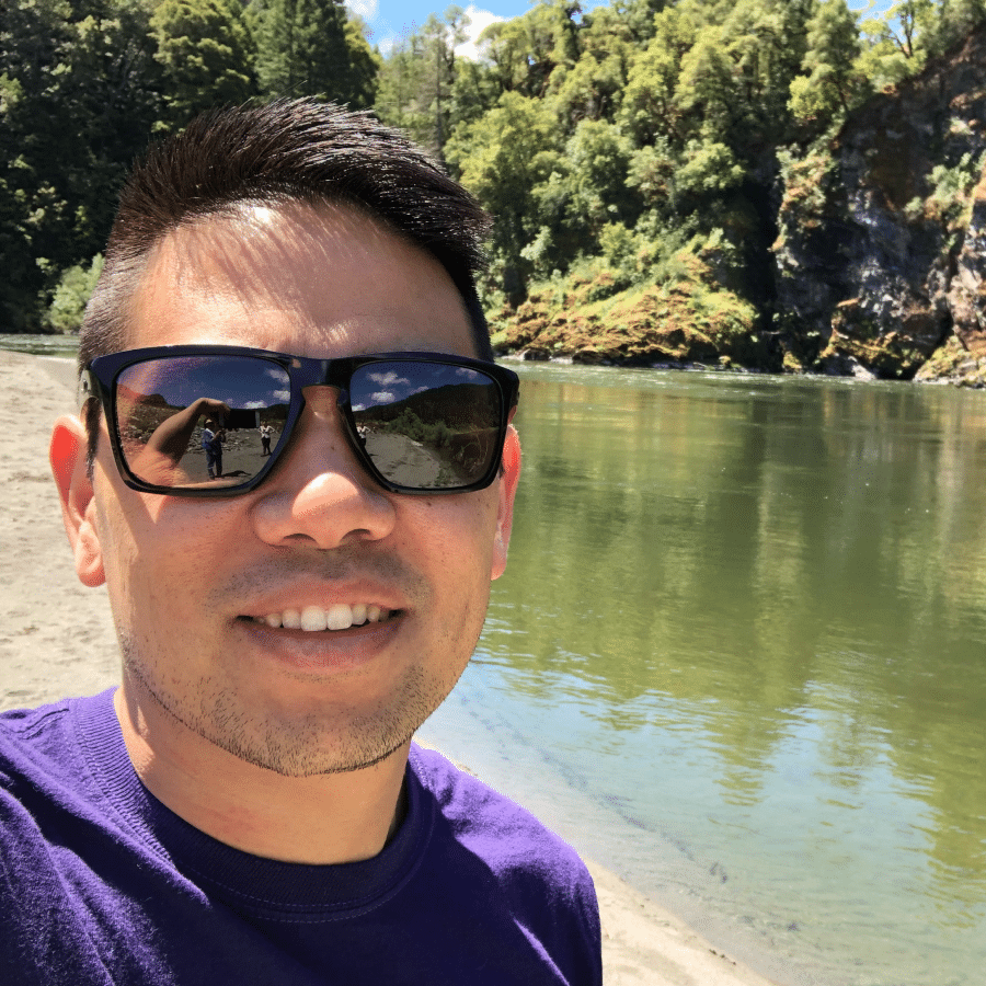
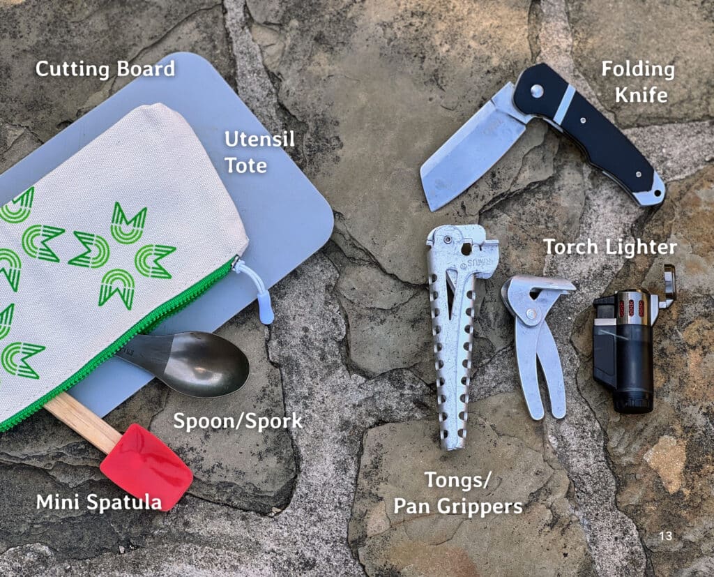
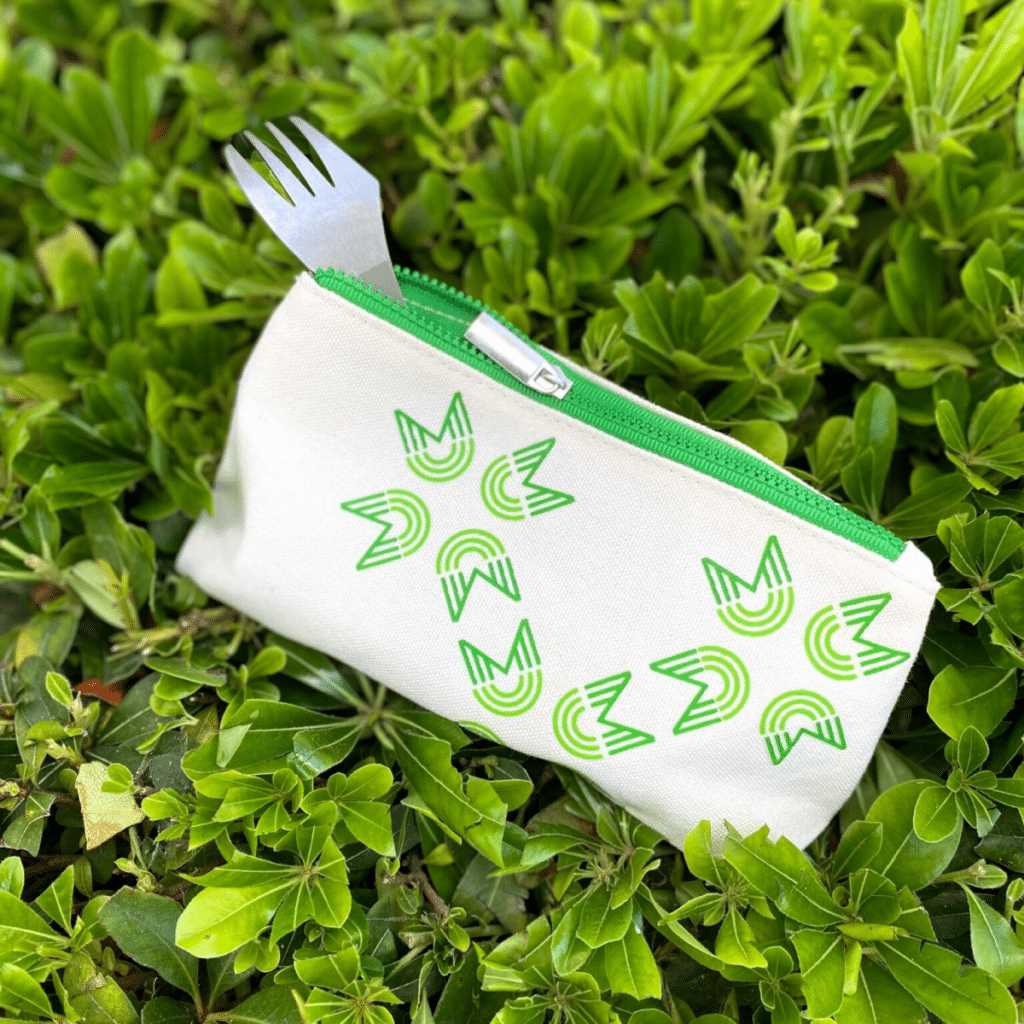
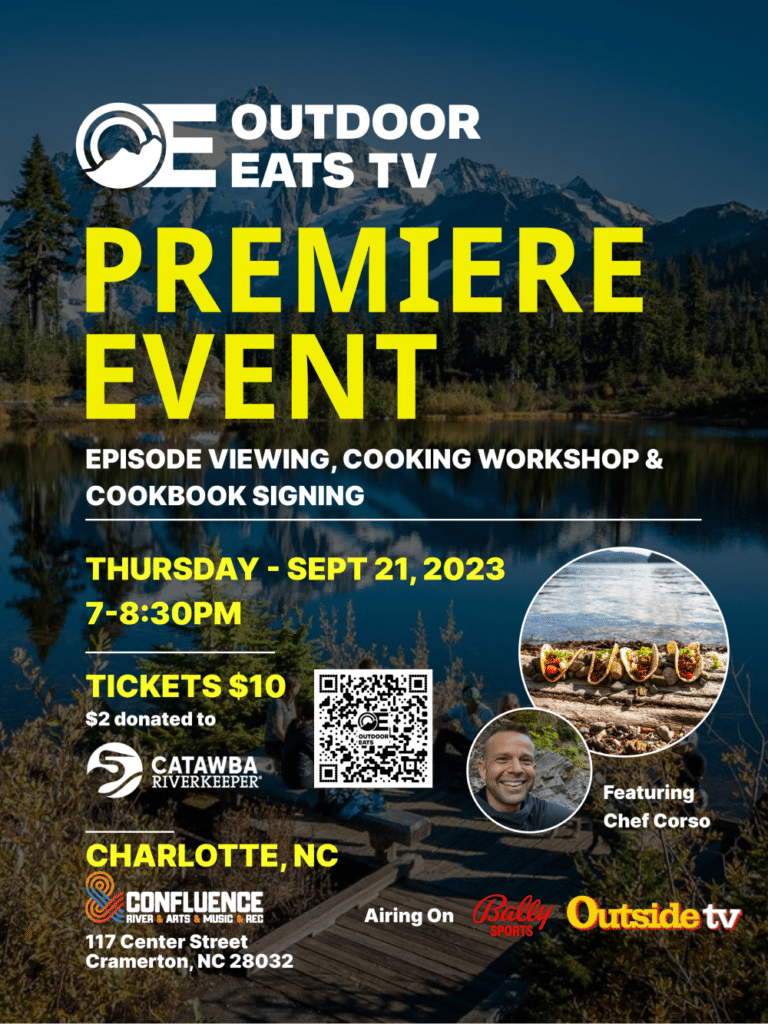
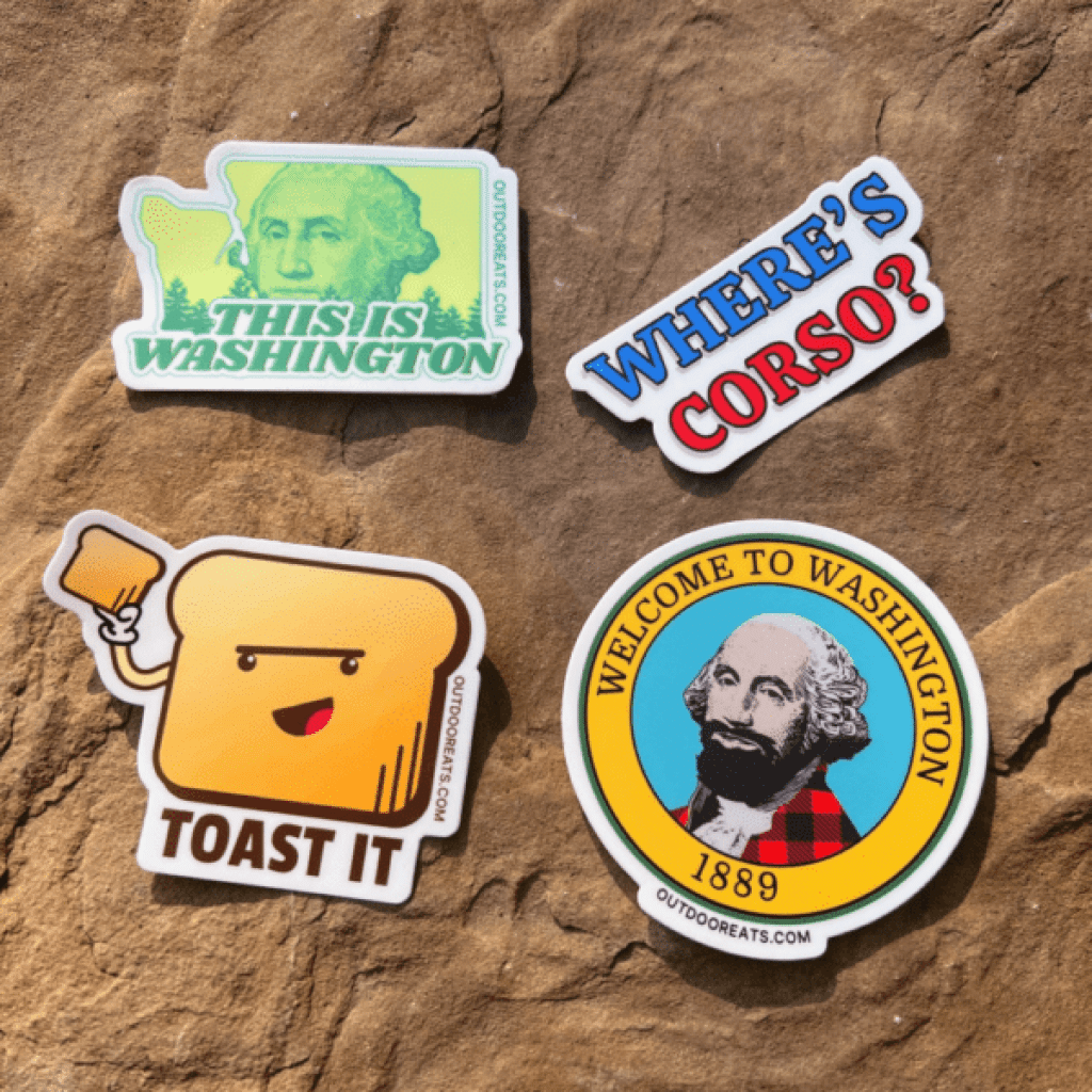
One creator and collaborator that has been along for the whole Outdoor Eats journey has been Makoto. He has been a great friend for a long time and we even worked together at a food company in our earlier professional years. He has since shifted over to graphic design full time. I still remember pitching him the first rough draft of the website in his office when I still had a full time “regular” job. His has been a great support for learning new design platforms, providing fresh eyes on projects and completing final cookbook formatting work for all editions in print. Besides the website and cookbook formatting, he has also helped with some fun side projects. Tote. Stickers. Posters. Website user experience (UX) Etc. He was even my very first guest on Outdoor Eats TV in Arizona! All of this work is incredibly important and it’s so nice to have a trained eye to be able to collaborate with for the final polish on projects. He lives in Poulsbo, WA with his wife and two kids.
Here are some of the projects we have worked on together:
Other thoughts
A question I get often is “how do I come up with the edition names?”
Great question. In the early days, I didn’t want just “edition 1” or “volume 2”. I wanted to have some fun with it. Also, in the early days, we were very much in the growth and figuring it out stages of the business so I thought that journey/map names fit the stage of my life at the time. Origin, Vista, Wander.
For every edition name, there are always about 5 or 6 names in consideration and one eventually rises to the top. Everyone has a different feeling when it comes to names. You may have a positive, negative or neutral position on any name from Wendy’s to The Lord of the Rings. “just name it!” You say.
It’s way harder than you think…
The hardest editions to name were Riverbend and Cascade.
We also considered oxbox, rapid, rapids, confluence, valley, basin and others to find the right fit.
What’s next?
As we roll into 2024, we will add another edition to the Trail Meals series. I can’t share the theme just yet but I am excited to partner with new designer as we explore some new styles and imagery.
Tom Eykemans – graphic design
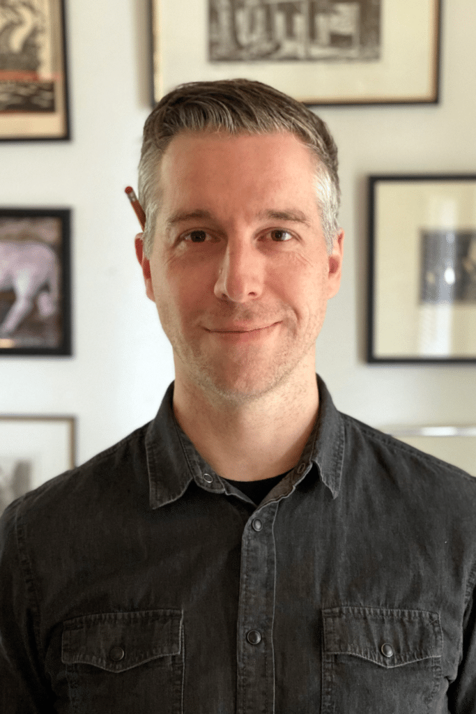
Tom’s full time job is actually to design books! Yes, we works for www.marquandbooks.com and they produce beautiful fine art books among other topics. He’s actually my good friend from high schools brother. Tom also has many side design projects cooking. He lives in Seattle, WA with his wife.
Here’s a teaser of what we have in the works:
Final thoughts
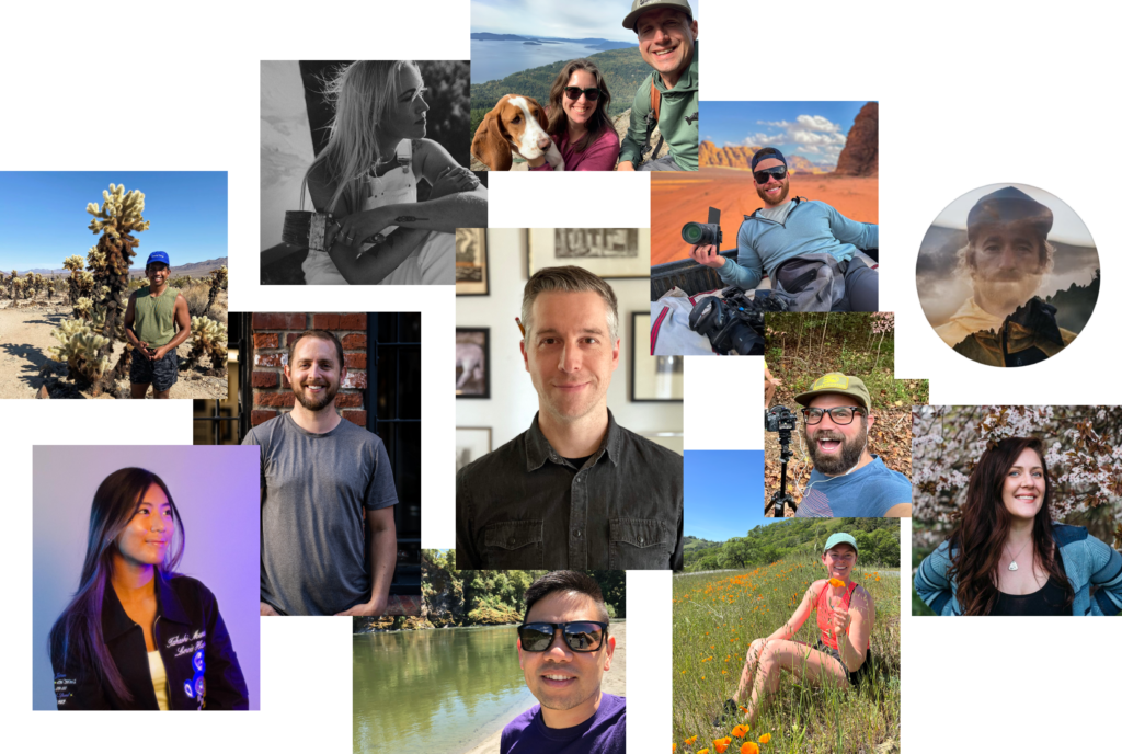
To recap, art in many mediums has it’s place is so many places of our lives. It’s been a consistent draw for me and in creating a new company, brand and product. I wanted the art to be fun and approachable and I think collectively we succeeded. I have a lot of ideas in my head but I am no artist or graphic designer. The collaborations with Alex, Ronald, Stephanie, James, Megan, Roland, Sarah, Paul, Erin, Mat, Franny, Makoto and Tom have all taken the art story of Outdoor Eats to beautiful place and I cannot thank them all enough for their creativity, quality work and their friendship. Look at all these happy creator faces! We wouldn’t be where we are without them. It really does take a village.
Bocaboca
Categorized in: Journal, News, Packing / Equipment

